Chapter 4 Classification Models
Thus far we have only been considering numeric response variables, generally referred to as regression problems. In this chapter we discuss classification, i.e. supervised learning problems where the response variable is categorical. More specifically, we will focus on methods of evaluating a classification model’s performance.
For the sake of illustration in this chapter we will only consider the logistic regression as linear classifier, although other classification models will be introduced in later chapters. The following section is based in part on section 4.3 of James et al. (2013).
For now, let us consider a binary classification task, for example:
- Determining whether a person will test positive or negative for the SARS-CoV-2 virus, based on a range of physiological metrics.
- Identifying a bank transaction as either fraudulent or legitimate on the basis of the user’s IP address, past transaction history, etc.
- Classifying email as spam or legitimate, depending on the features of the content and sender.
We will code the target variable as follows:
\[Y = \begin{cases} 1 & \text{if the outcome is } `` \text{class A"}\\ 0 & \text{if the outcome is } `` \text{class B"}\\ \end{cases}\]
Given data from some set of \(p\) features, we would like to define a decision rule based on a p-dimensional decision boundary that splits the feature space into two prediction regions corresponding to classes \(A\) and \(B\) respectively. When this decision boundary is linear – i.e. a straight line in two dimensions; a plane when \(p = 3\); and a hyperplane for higher dimensions – then the classifier yielding this decision boundary is considered linear. Some of the most widely applied linear classifiers include linear discriminant analysis, naive Bayes, support vector machine (with linear kernel), the perceptron, and logistic regression.
4.1 Logistic regression
In the previous chapter we touched on the benefits provided by the simplicity of a linear model, particularly in interpreting the regression coefficients. Using that same, simple additive structure:
\[\begin{equation} g(\boldsymbol{X}) = \beta_0 + \sum_{j=1}^p\beta_jX_j, \tag{3.1} \end{equation}\]we would like to relate the linear combination of input parameters to a classification of 0 or 1. We do so by modelling the probability that an observation belongs to some reference class:
\[\Pr(Y = j|\boldsymbol{X} = \boldsymbol{x}) = \begin{cases} p(\boldsymbol{x}) & \mbox{if }j = 1\\ 1 - p(\boldsymbol{x}) & \mbox{if }j = 0\\ \end{cases},\]
or in other words, \(Y \sim \text{Bernoulli}(p)\). Therefore, \(p(\boldsymbol{x})\) represents the probability that an observation is in class A given \(\boldsymbol{X} = \boldsymbol{x}\).
Now we need to define an appropriate function in order to map the linear function \(g(X)\) in Equation (3.1) to \(p(x) \in [0, 1]\). One option is the logistic function, yielding a logistic regression model:
\[\begin{equation} p(\boldsymbol{X}) = \frac{e^{\beta_0+\beta_1X_1+\cdots+\beta_pX_p}}{1+e^{\beta_0+\beta_1X_1+\cdots+\beta_pX_p}}. \tag{4.1} \end{equation}\]Also referred to as the logistic map or sigmoidal curve, this S-shaped function has asymptotes at 0 and 1, as later examples will illustrate. Through some simple manipulation, we can rewrite (4.1) as follows:
\[\begin{equation} \log \left( \frac{p(\boldsymbol{X})}{1 - p(\boldsymbol{X})} \right) = \beta_0 + \sum_{j=1}^p\beta_jX_j. \tag{4.2} \end{equation}\]The left-hand is referred to as the log odds or logit, and here we see that the logistic regression model has a logit that is linear in \(\boldsymbol{X}\).
Consider now the exponent of the log odds, i.e. the odds:
\[\begin{equation} \text{odds} = \frac{p(\boldsymbol{x})}{1 - p(\boldsymbol{x})} = \exp(\beta_0 + \beta_1x_1 + \cdots + \beta_px_p). \tag{4.3} \end{equation}\]This quantity – which we note can take on any value from 0 to \(\infty\) – can be interpreted as the odds that \(Y = 1\) vs \(Y = 0\), given \(\boldsymbol{x}\). In other words, “how many times more likely” we are to observe \(Y = 1\) than \(Y = 0\) for that particular set of \(\boldsymbol{x}\) values.
Before considering how to interpret the individual regression coefficients, we will briefly discuss their estimation.
4.1.1 Estimation
The most common approach for estimating the parameters \(\boldsymbol{\beta}\) is by way of maximising the likelihood. The likelihood, a function of the parameters, is simply the joint probability of observing the responses:
\[\begin{align} L(\boldsymbol{\beta}) &= \Pr(Y = y_1|\boldsymbol{X} = \boldsymbol{X}_1)\times \Pr(Y = y_2|\boldsymbol{X} = \boldsymbol{x}_2)\times \cdots \times \Pr(Y = y_n|\boldsymbol{X} = \boldsymbol{x}_n) \\ &= \prod_{i=1}^np(\boldsymbol{x}_i)^{y_i}(1 - p(\boldsymbol{x}_i))^{1 - y_i} \tag{4.4} \end{align}\]Maximising this quantity is akin to maximising the log-likelihood:
\[\begin{equation} \ell(\boldsymbol{\beta}) = \sum_{i=1}^n \left[ y_i\log(p(\boldsymbol{x}_i)) + (1 - y_i)\log(1 - p(\boldsymbol{x}_i)) \right], \tag{4.5} \end{equation}\]or, equivalently, minimising the negative log-likelihood (NLL), also referred to as the cross-entropy error function.
Finding the maximum is done in the usual way of setting the derivative of the log-likelihood equal to zero, yielding the so-called score equations. Since these equations are nonlinear in \(\boldsymbol{\beta}\), solving for \(\hat{\boldsymbol{\beta}}\) requires an optimisation procedure such as iteratively reweighted least squares. The details of this procedure are beyond the scope of this course, but can be found in pages 120-121 of Hastie et al. (2009).
4.1.2 Interpretation
The model parameters (regression coefficients) can be interpreted in a similar way to the linear model, by considering how a specific change in a coefficient’s corresponding parameters relates to the outcome. The simplest way of considering this effect is via the odds, given in Equation (4.3).
For example, consider the case where \(X_1\) increases by one unit, i.e. from \(x_1\) to \(x_1 + 1\). Then:
\[\begin{align} \text{odds}(X_1 = x_1 + 1) &= \exp(\beta_0 + \beta_1(x_1 + 1) + \cdots + \beta_px_p) \\ &= e^{\beta_1}\exp(\beta_0 + \beta_1x_1 + \cdots + \beta_px_p) \\ &= e^{\beta_1}\text{odds}(X_1 = x_1) \tag{4.6} \end{align} \]Therefore, increasing \(X_1\) by one unit (whilst holding all predictors constant), increases the odds of \(Y = 1\) by a factor of \(e^{\beta_1}\).
Note that the linear predictor may still take predictors with various measurement scales, including categorical variables represented by dummy variables, in which case we can interpret the change in odds for a specific category of the predictor against the reference category.
4.1.3 Prediction
Prediction for logistic regression is carried out in exactly the same way as with linear regression. We use the parameter estimates to evaluate the probabilities associated with each outcome:
\[\begin{equation} \hat{\Pr}(Y=1|\boldsymbol{X}) = \hat{p}(\boldsymbol{X}) = \frac{e^{\hat{\beta}_0+\hat{\beta}_1X_1+\cdots+\hat{\beta}_pX_p}}{1+e^{\hat{\beta}_0+\hat{\beta}_1X_1+\cdots+\hat{\beta}_pX_p}} \end{equation} \tag{4.7}\]In order to classify a new observation as belonging to a specific class, we need to apply a decision rule to this probability. For multiclass classification with \(K\) different levels, we will classify an observation to the class with the highest estimated probability:
\[\hat{Y} = \underset{k}{\text{argmax}} \left[ \hat{p}_k(\boldsymbol{X}) \right],\] where \(k = 1, \ldots, K\).
In the binary case, this implies that the decision rule has a threshold of 0.5:
\[\begin{equation} \hat{Y} = \begin{cases} 1 & \mbox{if } \hat{p}(\boldsymbol{X}) \geq 0.5\\ 0 & \mbox{if } \hat{p}(\boldsymbol{X}) < 0.5\\ \end{cases} \end{equation} \tag{4.8}\]We will return to this decision rule when considering model evaluation in section 4.2.
The threshold determines the exact decision boundary, although for logistic regression this boundary will always be linear, since the logit function is linear in the predictors. The decision boundary is best illustrated by means of an example.
4.1.4 Example 3 – Default data
This example entails the simulated (fictitious) dataset Default from the ISLR package. In this binary classification problem, we aim to predict whether or not an individual will default on their credit card payment based on three features:
student: Whether they are a student (yes/no)balance: The average balance that the customer has remaining on their credit card after making their monthly paymentincome: Annual income
Exploration
Ignoring the student variable for now, we see a very strong (somewhat exaggerated!) relationship between balance and default. Since the overall default rate is approximately 3%, we will only plot a random subsample of the non-defaulters, similar to what was done in Figure 4.1 of James et al. (2013).
library(ISLR)
data(Default)

def_prop <- mean(as.numeric(Default$default) - 1) #Proportion of defaulters...only 0.0333

#Let's plot non-defaulters to defaulters at a 4:1 ratio
def_rows <- which(Default$default == 'No')
set.seed(4026)
Default_plot <- Default[-sample(def_rows, length(def_rows)*(1 - def_prop*4)),]

# Using base R plotting
plot(Default_plot$balance, Default_plot$income,
     col = ifelse(Default_plot$default == 'Yes', 'darkorange', 'lightblue'),
     pch = ifelse(Default_plot$default == 'Yes', 3, 1),
     xlab = 'Balance', ylab = 'Income')
legend('topright', c('Default', 'Non-default'),
       col = c('darkorange', 'lightblue'),
       pch = c(3, 1))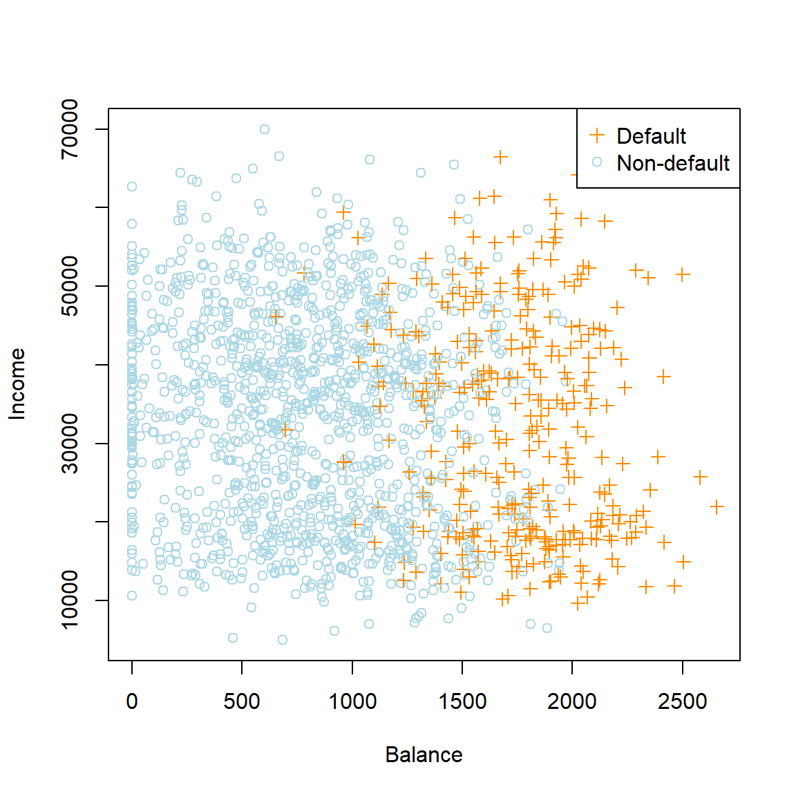
Figure 4.1: Annual incomes and monthly credit card balances of a subsample from the Default dataset
library(ggplot2)
library(gridExtra) #For grid.arrange() - to combine multiple ggplots in one plot
# Using ggplot2:
box_bal <- ggplot(Default_plot, aes(x = default, y = balance, group = default)) +
  geom_boxplot(aes(fill = default)) +
  scale_fill_manual(values=c('lightblue', 'darkorange')) +
  theme_bw() +
  theme(panel.grid.major = element_blank(),
        panel.grid.minor = element_blank(),
        panel.background = element_blank(),
        legend.position = 'none')

box_inc <- ggplot(Default_plot, aes(x = default, y = income, group = default)) +
  geom_boxplot(aes(fill = default)) +
  scale_fill_manual(values=c('lightblue', 'darkorange')) +
  theme_bw() +
  theme(panel.grid.major = element_blank(),
        panel.grid.minor = element_blank(),
        panel.background = element_blank(),
        legend.position = 'none')

grid.arrange(box_bal, box_inc, ncol = 2)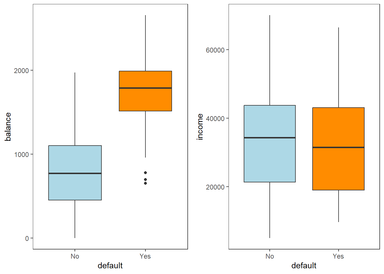
Figure 4.2: Boxplots of balance and income as a function of default status
Model fit
Now let’s fit a logistic regression model to the entire dataset, using all three features, and print the results.
library(kableExtra)
library(broom) #For nice tables
log_mod <- glm(default ~ ., data = Default, family = binomial)

log_mod %>%
  tidy() %>%
  kable(digits = 2, caption = 'Summary of logistic regression model fitted to the Default dataset') %>%
kable_styling(full_width = F)| term | estimate | std.error | statistic | p.value |
|---|---|---|---|---|
| (Intercept) | -10.87 | 0.49 | -22.08 | 0.00 |
| studentYes | -0.65 | 0.24 | -2.74 | 0.01 |
| balance | 0.01 | 0.00 | 24.74 | 0.00 |
| income | 0.00 | 0.00 | 0.37 | 0.71 |
As expected based on the visual exploration, we observe that balance is a highly significant predictor, whilst income is decidedly non-significant. The student indicator variable is also highly significant.
Interpretation
In order to interpret the regression coefficients, we calculate the exponent thereof.
exp(coef(log_mod)) %>%
  tidy() %>%
  kable(digits = 3,col.names = c('$X_j$', '$e^{\\beta_j}$'), escape = F,
        caption = 'Odds effects for the logistic regression model fitted to the Default dataset') %>%
kable_styling(full_width = F)| \(X_j\) | \(e^{\beta_j}\) |
|---|---|
| (Intercept) | 0.000 |
| studentYes | 0.524 |
| balance | 1.006 |
| income | 1.000 |
The coefficient corresponding to studentYes is with regards to the reference category “No”. Therefore, a student is approximately half as likely to default on their payment than a non-student when holding balance and income constant.
A one unit increase in the account balance increases the odds of defaulting by a factor of 1.006. Note, however, the scale of measurement – a one dollar increase amounts to very little. Instead consider that for every 100 unit increase in balance, the odds of defaulting increase by a factor of \(e^{100\beta_2} =\) 1.775.
In section 4.3 we show how to use the model for prediction on a different example. First, however, let us illustrate what is meant by “the decision boundary being linear”, together with a visual depiction of the logistic regression curve.
4.1.5 Decision boundaries
Continuing with the previous example, first consider the case where \(p = 1\), where we only include the balance variable. Applying the decision rule shown in Equation (4.8), i.e. applying a threshold predicted probability of 0.5, we observe the following fit and classifications:
# 1-dimensional fit
mod1 <- glm(default ~ balance, 'binomial', Default)

# Calculate curve values from fit
Y <- as.numeric(Default$default) - 1
x_range <- seq(0, max(Default$balance)*1.2, length.out = 1000)
coefs_1 <- mod1$coefficients
logit_1 <- coefs_1[1] + coefs_1[2]*x_range
sigmoid <- exp(logit_1)/(1 + exp(logit_1))

# Plot the fit
plot(x_range, sigmoid, type = 'l', lwd = 2, col = 'gray', xlab = 'Balance', ylab = 'p(x)')
tau <- 0.5 #Threshold
x_cutoff <- (log(tau/(1-tau)) - coefs_1[1])/(coefs_1[2])
abline(v = x_cutoff, lwd = 2, col = 'navy')
points(x_cutoff, 0, pch = 4, col = 'navy', cex = 2)
segments(-500, tau, x_cutoff, tau, col = 'gray', lty = 4)
points(Default$balance, Y, pch = 16, col = ifelse(Default$balance < x_cutoff, 'green', 'black'), cex = 0.5)
legend('right', c(expression(paste(hat(Y), ' = 1')), '', expression(paste(hat(Y), ' = 0'))),
       pch = 16, col = c('black', 'white', 'green'))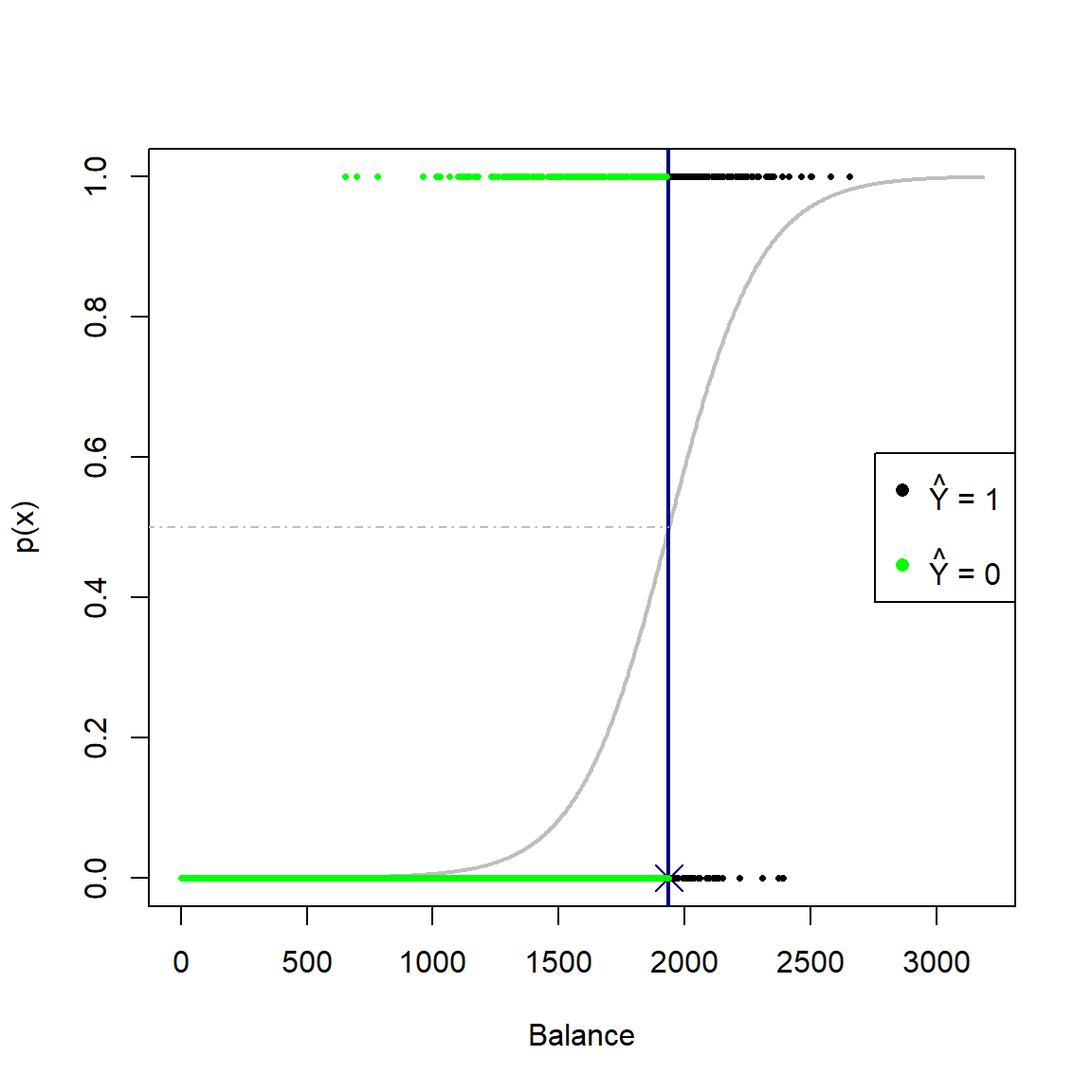
Figure 4.3: Logistic curve fitted to the default dataset using only balance as predictor. A decision rule based on a threshold of 0.5 is applied.
For the 1-dimensional case, the decision boundary is just a single point. In this instance, observations with balance \(\geq\) 1937 will yield \(\hat{p}(x) \geq 0.5\) and will be classified as defaulters.
The linearity of the decision boundary is better illustrated for \(p = 2\), so let’s add the income variable to the model.
# 2-dimensional fit
mod2 <- glm(default ~ balance + income, 'binomial', Default)
coefs_2 <- coef(mod2)

x1s <- seq(0, max(Default$balance)*1.2, length.out = 100)
x2s <- seq(min(Default$income)*0.8, max(Default$income)*1.2, length.out = 100)

sigmoid2 <- function(x1s, x2s) exp(cbind(1, x1s, x2s)%*%coef(mod2))/(1 + exp(cbind(1, x1s, x2s)%*%coef(mod2)))

# Plot the curve
plot2 <- persp3d(x1s, x2s, outer(x1s, x2s, sigmoid2), aspect = c(1, 1, 0.5), col = 'gray', alpha = 0.5,
                 xlab = 'balance', ylab = 'income', zlab = 'p(x)')
view3d(theta = 0, phi = -75, fov = 45, zoom = 0.75)  #Initial view settings

#Add vertical plane, just based on g(X) = 0
planes3d(coefs_2[2], coefs_2[3], 0, coefs_2[1], col = 'navy', lwd = 3, alpha = 0.5)

# Lines are tricky...
x2min <- min(x2s)
x1min <- -(coefs_2[1] + coefs_2[3]*x2min)/coefs_2[2]
abclines3d(x1min, x2min, 0, -1, coefs_2[2]/coefs_2[3], 0, col = 'navy', lwd = 3)
abclines3d(x1min, x2min, 0.5, -1, coefs_2[2]/coefs_2[3], 0, col = 'navy', lwd = 3)
#Why doesn't this add the lines???

# Use predict() for the classifications
p2 <- predict(mod2, type = 'response')
points3d(Default$balance, Default$income, Y, col = ifelse(p2 >= 0.5, 'green', 'black'), size = 6)
Note that this figure is interactive in html.
Here we can see that the contour on the sigmoid surface corresponding to a constant threshold yields a straight line. Projecting this line orthogonally onto the xy-plane together with the observations yields our original plot of the data in Figure 4.1 (this time with all the data, not just a subset) with the resulting linear decision boundary.
# Same plot as above, but all the data
plot(Default$balance, Default$income,
     col = ifelse(Default$default == 'Yes', 'darkorange', 'lightblue'),
     pch = ifelse(Default$default == 'Yes', 3, 1),
     xlab = 'Balance', ylab = 'Income')
legend('topright', c('Default', 'Non-default'),
       col = c('darkorange', 'lightblue'),
       pch = c(3, 1))
# Add the decision boundary
abline(-coefs_2[1]/coefs_2[3], -coefs_2[2]/coefs_2[3], col = 'navy', lwd = 3) #Do the math!!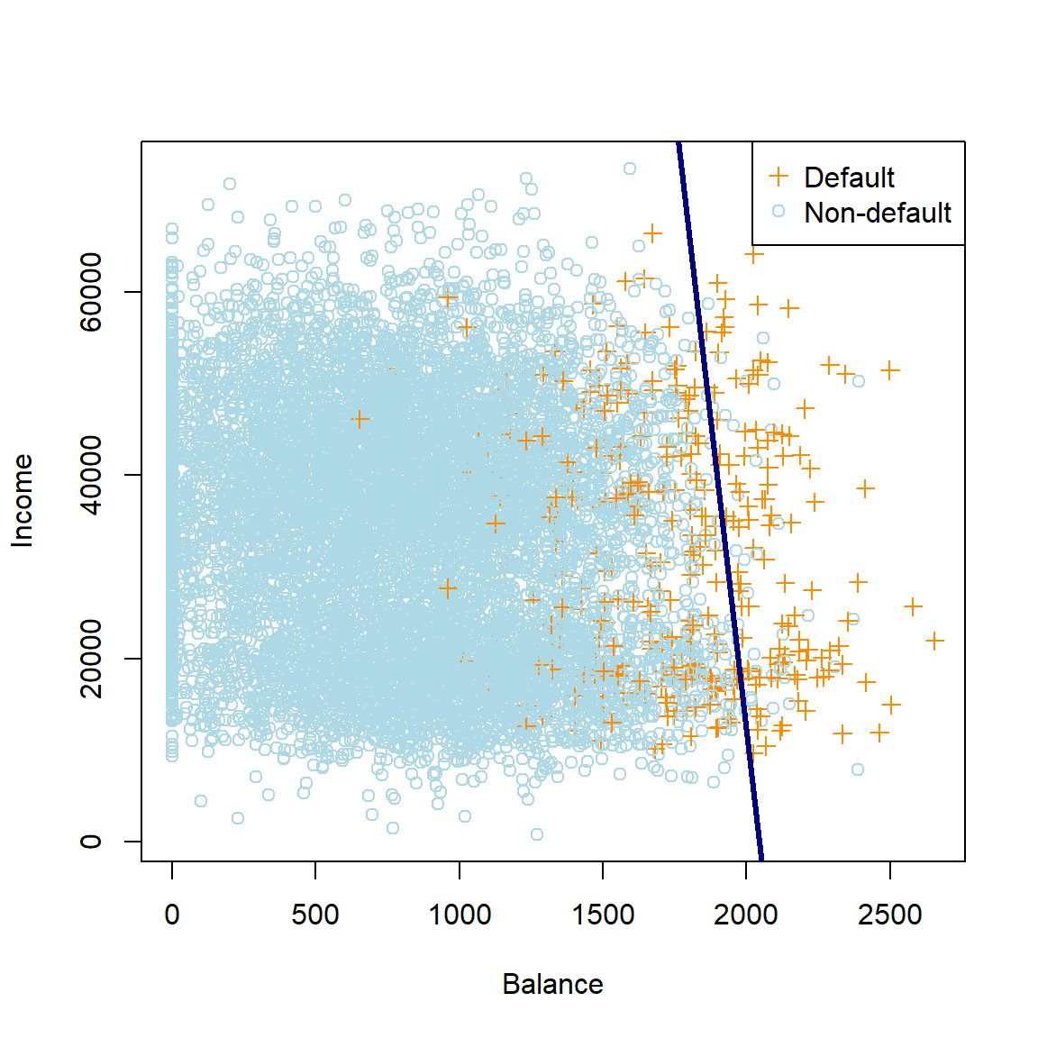
Figure 4.4: The logistic regression decision boundary for the default dataset using balance and income as predictors.
Note that the decision boundary for the decision rule threshold \(\hat{p}(\boldsymbol{X}) \geq 0.5\) corresponds to the set of points in the parameters space for which the odds are 1 (or, equivalently, the log-odds are zero). Showing this is left as a homework exercise. Using this fact allows us to easily determine the boundary in Figure 4.4.
Finally, we will now add the student variable (coded as 0 and 1) to the model. The following plot shows a 3-dimensional image of the data, with the decision boundary added as a plane. Note that the sigmoidal curve will be 4-dimensional here.
# 3-dimensional fit
mod3 <- glm(default ~ balance + income + student, 'binomial', Default)
coefs_3 <- coef(mod3)

# Plot the data
plot3d(Default$student, Default$balance, Default$income,
       xlab = 'student', ylab = 'balance', zlab = 'income',
       col = ifelse(Default$default == 'Yes', 'orange', 'lightblue'),
       size = 5)
view3d(theta = 45, phi = 45, fov = 45, zoom = 0.9)  #Initial view settings

# Add the decision boundary. Easy with planes3d, since it is set up similarly
planes3d(coefs_3[4], coefs_3[2], coefs_3[3], coefs_3[1], col = 'navy', lwd = 3, alpha = 0.5)
Note that this figure is interactive in html.
Now that we have sufficiently explored the logistic regression’s decision boundaries, we turn our attention to measuring the accuracy of the classifications resulting from these decision boundaries.
4.2 Model evaluation
Any classification method yields a set of predicted outcomes that can be compared to the observed outcomes to quantify the model’s performance. The simplest loss function for measuring a classification model’s accuracy is the misclassification rate, which is simply the proportion of observations for which the classified label does not match the actual label:
\[\begin{equation} \text{Error} = \frac{1}{n}\sum_{i=1}^{n}\mathbb{I}\left(Y_i \ne \hat{Y}_i \right) = \frac{\text{# of misclassifications}}{n} \tag{4.9} \end{equation}\]A useful way of representing a fitted model’s predicted labels against the observed, is by means of a confusion matrix, which is just a table showing the number of observations in each combination of observed and predicted label. Returning to the Default example above, let’s use the model with all three predictors and the decision rule \(\hat{p}(\boldsymbol{X}) \geq 0.5\) to create this table.
# First get predictions (probabilities) from the model
phat3 <- predict(mod3, Default, 'response')

# Then apply the decision rule
yhat3 <- ifelse(phat3 >= 0.5, 'Yes', 'No')

y <- Default$default #True labels

# Using table(). Caret package has a function too
confmat3 <- table(yhat3, y, dnn = c('Predicted label', 'True label'))

# Calculate training error
error3 <- mean(yhat3 != y)

# confmat3 %>% kable(caption = 'Confusion matrix for the saturated logistic regression model fitted to the Default dataset') %>% kable_styling(full_width = F) #Failing to preserve the headers

confmat3
## True label
## Predicted label No Yes
## No 9627 228
## Yes 40 105The values on the diagonals represent the correct classifications, whilst the off-diagonals are the misclassifications. Here we observe an error rate of 2.7%, or equivalently a classification accuracy of 97.3%.
Although this sounds excellent, we need to bear in mind that the data were quite severely imbalanced, since the vast majority of individuals were non-defaulters. In fact, if we had simply predicted every observations to be “No”, then our training error would only have been 3.3%. This does not seem like a massive difference compared to 2.7%, yet we would not correctly identify a single defaulter with this approach!
Clearly we need to be more nuanced in our calculation of misclassifications. Therefore, define the following errors:
- False Positive (FP): Classify \(\hat{Y} =1\) when \(Y =0\)
- False Negative (FN): Classify \(\hat{Y} =0\) when \(Y =1\)
These quantities, together with the True Positives (TP) and True Negatives (TN), make up the confusion matrix:
| True state | |||
| Negative | Positive | ||
| Prediction | Negative | TN | FN |
| Positive | FP | TP | |
| Tot Neg | Tot Pos |
We can now define several metrics to describe the performance of a classification algorithm across various aspects, some of which have several equivalent names:
- True Positive Rate = TPR = Sensitivity = Recall = \(\frac{TP}{Tot Pos}\)
- True Negative Rate = TNR = Specificity = \(\frac{TN}{Tot Neg}\)
- Positive Predictive Value = PPV = Precision = \(\frac{TP}{TP + FP}\)
- Negative Predictive Value = NPV = \(\frac{TN}{TN + FN}\)
Note that the complements of these values yield the corresponding errors. Various other metrics exist for specific testing purposes. For example, the F1 score – which represents the harmonic mean of precision and sensitivity – is a popular performance metric, especially when evaluating performance on imbalanced data7:
\[F_1=2\frac{\text{Precision} \times \text{Recall}}{\text{Precision} + \text{Recall}}\]
This metric ranges from 0 to 1, with higher being better. It is often used to gauge the performance of classification models across a variety of different tasks, for example in computer vision (image classification, object detection, segmentation), Natural Language Processing (named entity recognition, sentiment analysis, document classification), recommender systems, etc.
All of these metrics can be calculated manually from a confusion matrix. Alternatively, we could use packages like caret or MLmetrics to set up the confusion matrix and get the measurements directly, as shown here:
library(MLmetrics)
library(caret)

# Example using MLMetrics function, caret has similar
f1_mod3 <- MLmetrics::F1_Score(y, yhat3, positive = 'Yes')

# Confusion matrix and metrics using caret
caretmat3 <- confusionMatrix(as.factor(yhat3), y, positive = 'Yes') #NB to set the ref category!
caretmat3
## Confusion Matrix and Statistics
##
## Reference
## Prediction No Yes
## No 9627 228
## Yes 40 105
##
## Accuracy : 0.9732
## 95% CI : (0.9698, 0.9763)
## No Information Rate : 0.9667
## P-Value [Acc > NIR] : 0.0001044
##
## Kappa : 0.4278
##
## Mcnemar's Test P-Value : < 2.2e-16
##
## Sensitivity : 0.3153
## Specificity : 0.9959
## Pos Pred Value : 0.7241
## Neg Pred Value : 0.9769
## Prevalence : 0.0333
## Detection Rate : 0.0105
## Detection Prevalence : 0.0145
## Balanced Accuracy : 0.6556
##
## 'Positive' Class : Yes
## Our logistic regression model on the Default dataset yielded a training F1 score of 0.439, which provides a more informative measure of the model’s performance than just considering the accuracy. This metric balances the facts that the model only correctly identified 31.53% of defaulters (recall), and of those predicted as defaulters, 72.41% had actually defaulted (precision).
We have noted that all of the above metrics can be calculated from the confusion matrix, regardless of which underlying model yielded the matrix. But the exact confusion matrix is determined by the predictions, which in turn depend on the decision rule threshold. Now that we know all errors are not equal, can we perhaps change the threshold to adjust certain metrics? Note that, for now, all of this is applied to just the training set in order to illustrate the principle.
4.2.1 Changing the threshold
By setting \(\hat{Y} = 1\) if \(\hat{p}(X) > 0.5\), we are actually being naive about our choice of decision threshold when attempting to map probabilities to classifications. This decision rule attempts to approximate the Bayes classifier, which minimises the total error rate. However, this implicitly assumes that the two error types (FP & FN) are equally bad, which will not necessarily be the case, depending on the problem at hand. For the Default example, we might be specifically interested in classifying default events (TP), perhaps at the (lesser) cost of false positives. By adjusting the threshold level (\(\tau\)), we can accommodate this asymmetric cost of misclassification.
To illustrate this, let’s use the same saturated model on the Default data as previously, but lower the decision rule threshold to \(\tau = 0.2\), such that \(\hat{Y} = 1\) if \(\hat{p}(X) > 0.2\). Therefore, we are more liberal in our classification of defaulters.
yhat3_2 <- ifelse(phat3 >= 0.2, 'Yes', 'No')
confmat3_2 <- table(yhat3_2, y, dnn = c('Predicted label', 'True label'))
confmat3_2
## True label
## Predicted label No Yes
## No 9390 130
## Yes 277 203By manual inspection, we can see that the number of correctly classified defaulters almost doubled from 105 to 203. Therefore, the true positive rate (recall or sensitivity) increased, although it would have come at the cost of a worse false positive rate (fallout or 1 - specificity), as we see in Table 4.5. Note that the overall accuracy slightly decreased.
tprs <- c(sensitivity(as.factor(yhat3), y, 'Yes'),
          sensitivity(as.factor(yhat3_2), y, 'Yes'))

# Note that the following function requires the negative label specified! Always check help files.
fprs <- c(1 - specificity(as.factor(yhat3), y, 'No'),
          1 - specificity(as.factor(yhat3_2), y, 'No'))
accs <- c(mean(yhat3 == y), mean(yhat3_2 == y))

compar <- rbind(tprs, fprs, accs)
colnames(compar) <- c('$\\tau$ = 0.5', '$\\tau$ = 0.2')
rownames(compar) <- c('TPR', 'FPR', 'Accuracy')

compar %>% kable(digits = 3, caption = 'Comparison of the TPR, FPR, and accuracy for two different decision rule thresholds -- 0.5 and 0.2 -- applied to the saturated logistic regression model fitted to the Default dataset.')| \(\tau\) = 0.5 | \(\tau\) = 0.2 | |
|---|---|---|
| TPR | 0.315 | 0.610 |
| FPR | 0.004 | 0.029 |
| Accuracy | 0.973 | 0.959 |
Another way of measuring how well the classifier is performing, is by varying \(\tau\) over a range of values and keeping track of the TPR and FPR. To illustrate this, consider again the 1-variable model where we include only Balance. For convenience and clearer illustration, Figure 4.5 only displays a subsample of 200 observations.
# Create a range of thresholds and empty vectors for their corresponding metrics
taus <- seq(0, 1, 0.01)
TPR <- vector(length = length(taus))
FPR <- vector(length = length(taus))

# Same curve as above
set.seed(1)
sub_Default <- Default[sample.int(nrow(Default), 200),] #Only 200 obs
mod_t <- glm(default ~ balance, data = sub_Default, family = 'binomial')
Y_sub <- as.numeric(sub_Default$default) - 1
x_range <- seq(0, max(sub_Default$balance)*1.2, length.out = 1000)
coefs_t <- mod_t$coefficients
logit_t <- coefs_t[1] + coefs_t[2]*x_range
sigmoid <- exp(logit_t)/(1 + exp(logit_t))
phat_t <- predict(mod_t, type = 'response')

par(mfrow=c(1,2))

iter <- 0
for (tau in taus){
  iter <- iter + 1
  yhat_t <- ifelse(phat_t >= tau, 1, 0)
  x_cutoff <- (log(tau/(1-tau)) - coefs_t[1])/(coefs_t[2]) #solve from logit

  # Left plot (curve)
  plot(x_range, sigmoid, type = 'l', lwd = 2, col = 'orangered', xlab = 'Balance', ylab = 'p(x)')
  abline(v = x_cutoff, lwd = 2, col = 'navy')
  segments(-500, tau, x_cutoff, tau, col = 'gray', lty = 4)
  points(sub_Default$balance, Y_sub, pch = 16, col = ifelse(sub_Default$balance < x_cutoff, 'green', 'black'))
  legend('right', c(expression(paste(hat(Y), ' = 1')), '', expression(paste(hat(Y), ' = 0'))),
         pch = 16, col = c('black', 'white', 'green'))

  TPR[iter] <- sum(yhat_t*Y_sub == 1)/sum(Y_sub)
  FPR[iter] <- sum(yhat_t == 1 & Y_sub == 0)/sum(Y_sub == 0)
  E <- mean(yhat_t != Y_sub)
  text(0, 0.9, pos = 4, substitute(paste('Tau = ', tau), list(tau = tau)), cex = 1.2)
  text(0, 0.8, pos = 4, substitute(paste('TPR = ', TPR), list(TPR = round(TPR[iter], 3))), cex = 1.2)
  text(0, 0.7, pos = 4, substitute(paste('FPR = ', FPR), list(FPR = round(FPR[iter], 3))), cex = 1.2)
  text(0, 0.6, pos = 4, substitute(paste('Misclass = ', E), list(E = round(E, 3))), cex = 1.2)

  # Right plot (errors)
  plot(0,0, 'n', xlim = c(0,1), ylim = c(0,1), ylab = '', xlab = 'Threshold')
  lines(seq(0, tau, length.out = iter), TPR[1:iter], 'l', lwd = 2, col = 'orange')
  lines(seq(0, tau, length.out = iter), FPR[1:iter], 'l', lwd = 2, col = 'lightblue')
  legend('topright', c('TPR', 'FPR'), lty = 1, lwd = 2, col = c('orange', 'lightblue'))
}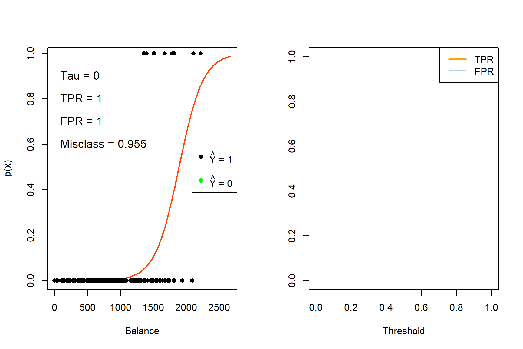
Figure 4.5: The effect of varying the decision rule threshold on the TPR and FPR
This pattern can now be combined in the Receiver Operating Characteristic (ROC) curve.
4.2.2 ROC Curve
The most common way of displaying how TPR and FPR change as the threshold changes, is by plotting each on an axis for different values of the threshold. This yields the ROC curve, which provides an indication of the performance of a classifier over the entire range of decision rules, allowing us to compare different classifiers in a more rigorous way.
Figure 4.6 shows the ROC curve for the saturated model fitted to the entire Default dataset with the points corresponding to \(\tau = 0.2\) and \(\tau = 0.5\) – for which we calculated the confusion matrices earlier – highlighted on the curve. We will make use of the ROCR package.
library(ROCR)

# Using the full model
pred <- prediction(phat3, Y)
perf  <- performance(pred, 'tpr', 'fpr')
plot(perf, colorize = FALSE, col = 'black')
lines(c(0,1), c(0,1), col = 'gray', lty = 4)

# tau = 0.5
points(compar[1,1] ~ compar[2,1], col = 'red', pch = 16)
text(compar[1,1] ~ compar[2,1], labels = 0.5, pos = 4)

# tau = 0.2
points(compar[1,2] ~ compar[2,2], col = 'red', pch = 16)
text(compar[1,2] ~ compar[2,2], labels = 0.2, pos = 4)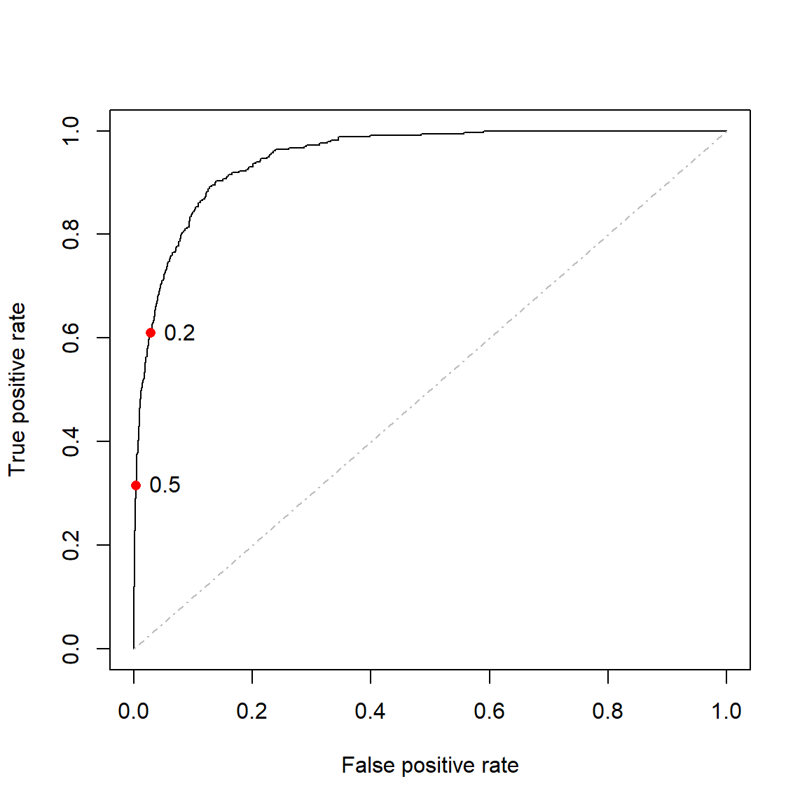
Figure 4.6: ROC curve for the full model fitted to the Default dataset. Thresholds of 0.2 and 0.5 are highlighted.
A completely random classifier would (on average) lie on the diagonal of the ROC curve, whilst a classifier exclusively predicting one category would lie exactly on the diagonal. A perfect classifier would perfectly predict all positive cases and never falsely identify an observation as positive, although note that this would only be possible in the case of perfectly linearly separable data.
For real-world data, an ideal classifier would lie as close as possible to the top left corner of the plot and we compare models by measuring how close they are to this ideal. The way to identify this is by calculating the area under the curve (AUC), which is simply a value between 0.5 and 1 (technically 0 and 1) measuring a binary classification model’s ability to distinguish between positive and negative responses.
Using ROCR, we can calculate the AUC for the ROC curve in Figure 4.6 as 0.95. Although this metric can be objectively interpreted, the real value lies in comparing metrics across different models, ideally in a way that estimates out-of-sample performance.
One way of potentially improving the fit of a logistic regression model, is once again through regularisation.
4.3 Regularisation
In the previous chapter we considered the lasso, aka \(L_1\) regularisation as a variable selection method for a linear (or any parameterised) regression model. This was predicated on penalising the loss function, the RSS, which is minimised in order to find the estimated regression coefficients.
We can apply the same reasoning to logistic regression, noting again that for this problem we estimate the regression coefficients by maximising the likelihood. Therefore, the penalty term is subtracted, instead of added.
Let \(\boldsymbol{\beta} = \begin{bmatrix} \beta_1 & \beta_2 & \cdots & \beta_p \end{bmatrix}\). Now, using (4.1), the log-likelihood in (4.5) can be written as follows:
\[\begin{align} \ell(\boldsymbol{\beta}) &= \sum_{i=1}^n \left[ y_i\log(p(\boldsymbol{x}_i)) + (1 - y_i)\log(1 - p(\boldsymbol{x}_i)) \right] \\ &= \sum_{i=1}^n \left[ y_i\log\left(\frac{e^{\beta_0 + \boldsymbol{\beta}'\boldsymbol{x}_i}}{1 + e^{\beta_0 + \boldsymbol{\beta}'\boldsymbol{x}_i}}\right) + \log\left(1 - \frac{e^{\beta_0 + \boldsymbol{\beta}'\boldsymbol{x}_i}}{1 + e^{\beta_0 + \boldsymbol{\beta}'\boldsymbol{x}_i}} \right) - y_i\log\left(1 - \frac{e^{\beta_0 + \boldsymbol{\beta}'\boldsymbol{x}_i}}{1 + e^{\beta_0 + \boldsymbol{\beta}'\boldsymbol{x}_i}} \right) \right] \\ &= \sum_{i=1}^n \left[y_i\left(\beta_0 + \boldsymbol{\beta}'\boldsymbol{x}_i \right) - y_i\log\left(1 + e^{\beta_0 + \boldsymbol{\beta}'\boldsymbol{x}_i} \right) - \log\left(1 + e^{\beta_0 + \boldsymbol{\beta}'\boldsymbol{x}_i} \right) + y_i\log\left(1 + e^{\beta_0 + \boldsymbol{\beta}'\boldsymbol{x}_i} \right) \right] \\ &= \sum_{i=1}^n \left[y_i\left(\beta_0 + \boldsymbol{\beta}'\boldsymbol{x}_i \right) - \log\left(1 + e^{\beta_0 + \boldsymbol{\beta}'\boldsymbol{x}_i} \right) \right]. \tag{4.10} \end{align}\]Therefore, \(L_1\) regularised logistic regression parameters are given by:
\[\begin{equation} \hat{\boldsymbol{\beta}}_L = \underset{\boldsymbol{\beta}}{\text{argmax}}\left\{ \sum_{i=1}^n \left[y_i\left(\beta_0 + \boldsymbol{\beta}'\boldsymbol{x}_i \right) - \log\left(1 + e^{\beta_0 + \boldsymbol{\beta}'\boldsymbol{x}_i} \right)\right] - \lambda \sum_{j=1}^p |\beta_j| \right\}. \tag{4.11} \end{equation}\]As in the linear regression model, the predictors are generally standardised and the intercept term is not penalised. Once again, the optimsation methods used to solve for the coefficients are beyond the scope of this course.
We shall illustrate the application by means of an example.
4.3.1 Example 4 – Heart failure
Chicco & Jurman (2020) analyses the medical records of 299 patients who experienced heart failure, with data collected during the patients’ follow-up period. Each patient profile contains 12 clinical features, the details of which are given in Table 1 of the paper. The goal is to predict the 13th variable, namely death event (binary).
After setting aside 20% of the data for testing, start by fitting the saturated model to the training data.
# Read in the data and turn the categorical features to factors
heart <- read.csv('data/heart.csv', header = TRUE,
                  colClasses = c(anaemia='factor',
                                 diabetes = 'factor',
                                 high_blood_pressure = 'factor',
                                 sex = 'factor',
                                 smoking = 'factor',
                                 DEATH_EVENT = 'factor'))

# Create indices for train/test split
set.seed(4026)
train <- sample(nrow(heart), size=0.8*nrow(heart))

# Always check the prevalence rate
y_train <- heart$DEATH_EVENT[train]

# Fit "vanilla" logistic regression
heart_lr <- glm(DEATH_EVENT ~ ., data = heart, subset = train, family = 'binomial')
heart_lr %>%
  tidy() %>%
kable(digits = 2, caption = 'Saturated logistic regression model fitted to the heart failure dataset')| term | estimate | std.error | statistic | p.value |
|---|---|---|---|---|
| (Intercept) | 15.52 | 7.09 | 2.19 | 0.03 |
| age | 0.06 | 0.02 | 3.05 | 0.00 |
| anaemia1 | 0.19 | 0.39 | 0.49 | 0.63 |
| creatinine_phosphokinase | 0.00 | 0.00 | 1.63 | 0.10 |
| diabetes1 | 0.34 | 0.39 | 0.89 | 0.37 |
| ejection_fraction | -0.07 | 0.02 | -4.01 | 0.00 |
| high_blood_pressure1 | -0.05 | 0.40 | -0.12 | 0.90 |
| platelets | 0.00 | 0.00 | -0.84 | 0.40 |
| serum_creatinine | 0.66 | 0.20 | 3.28 | 0.00 |
| serum_sodium | -0.11 | 0.05 | -2.22 | 0.03 |
| sex1 | -0.81 | 0.46 | -1.76 | 0.08 |
| smoking1 | 0.13 | 0.46 | 0.27 | 0.79 |
| time | -0.02 | 0.00 | -6.00 | 0.00 |
First, we observe that approximately a third of the patients in the training set passed away (33.9% to be exact).
In Table 4.6 we see that a few of the predictors are not statistically significant in this model at any reasonable significance level and should be removed, most notably the hypertension, smoking, and decrease of hemoglobin indicator variables (high_blood_pressure1, smoking1 and anaemia1).
Using \(L_1\) regularisation to perform the variable selection:
library(glmnet)
library(dplyr)  #Gentle introduction to some tidyverse functions
library(plotmo) #Specifically for glmnet plotting (also has a gbm function)

# Using dplyr:
x_train <- select(heart, -DEATH_EVENT) %>% slice(train)

# Fit the lasso and plot using plotmo
heart_l1 <- glmnet(x_train, y_train, alpha = 1, standardize = T, family = 'binomial')
plot_glmnet(heart_l1, xvar = 'norm')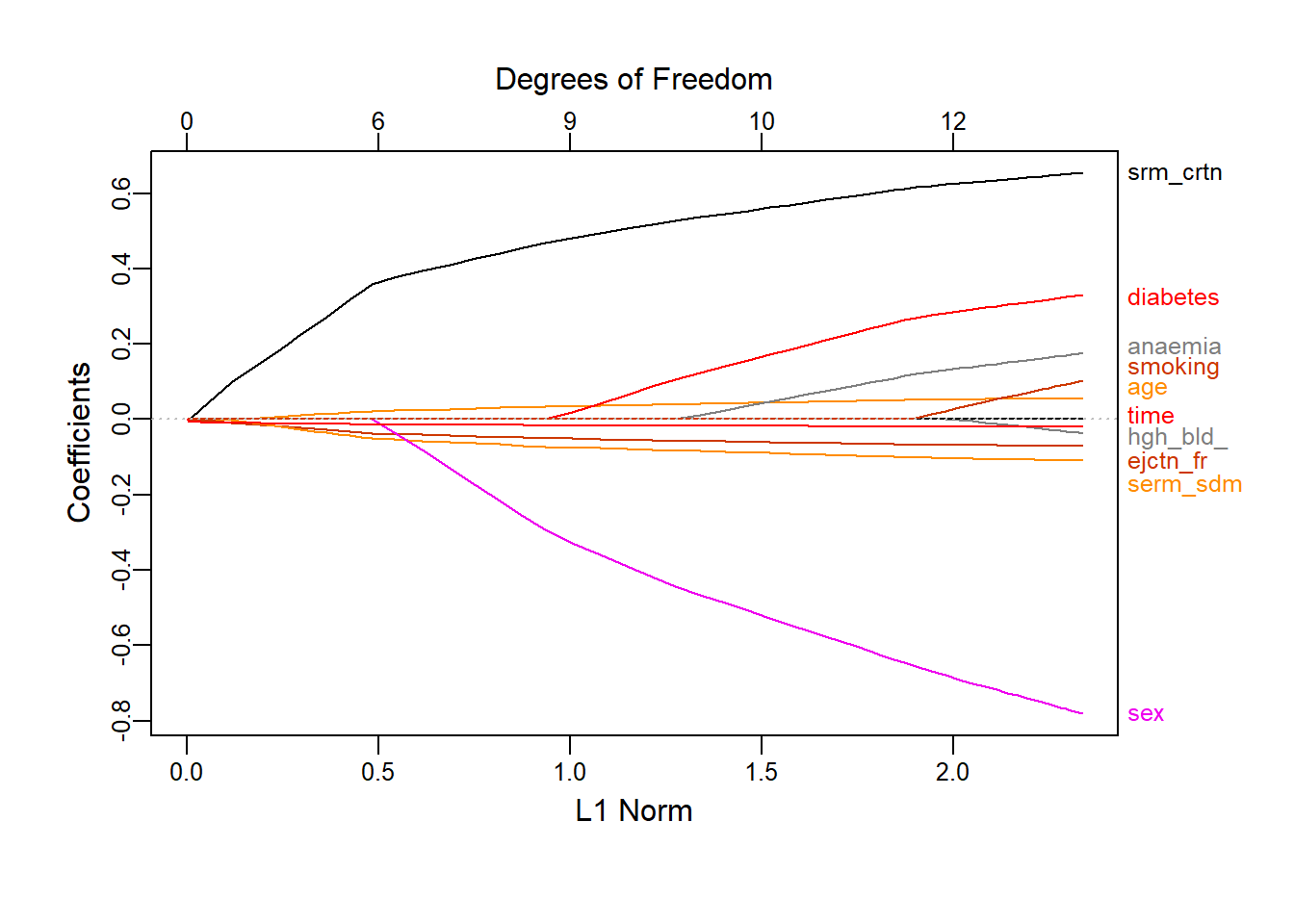
Figure 4.7: Coefficient profiles for \(L_1\) logistic regression on the heart failure dataset as a function of the constraint
Figure 4.7 shows how the regression coefficients are reduced to zero as the \(L_1\) norm constraint decreases. To decide on the penalty to apply – and by extension the number of variables to drop – we again use 10-fold cross-validation with classification error as loss function.
# cv.glmnet cannot take factor variables directly, we must create explicit dummy variables
x_train_dummies <- makeX(x_train) #For which the package has this function

set.seed(1)
heart_l1_cv <- cv.glmnet(x_train_dummies, y_train, family = 'binomial', type.measure = 'class')

# Plot
plot(heart_l1_cv)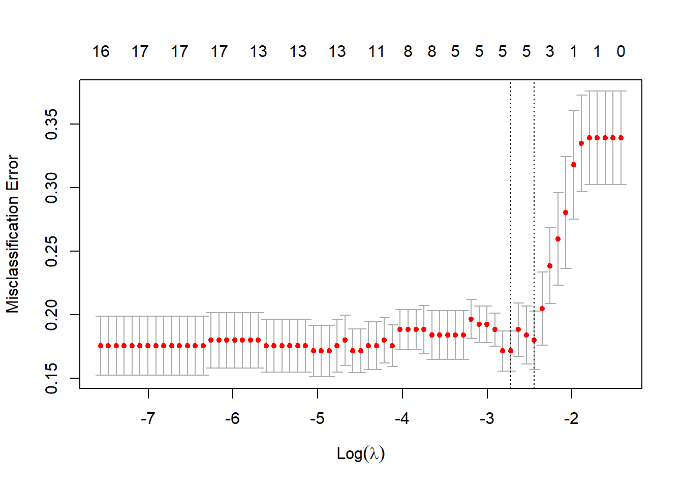
Figure 4.8: 10-fold CV classification errors as a function of \(\log(\lambda)\) for \(L_1\) logistic regression applied to the heart failure dataset
In Figure 4.8 we see that the best model according to cross-validated classification accuracy contains five features. However, it is crucial to note that this model displays high variance, and that setting different seeds will yield different results! The selected features in this instance are the ones with non-zero coefficients below:
## 18 x 1 sparse Matrix of class "dgCMatrix"
##                          lambda.min
## (Intercept)                   3.646
## age                           0.009
## anaemia0                      .
## anaemia1                      .
## creatinine_phosphokinase      .
## diabetes0                     .
## diabetes1                     .
## ejection_fraction            -0.020
## high_blood_pressure0          .
## high_blood_pressure1          .
## platelets                     .
## serum_creatinine              0.200
## serum_sodium                 -0.023
## sex0                          .
## sex1                          .
## smoking0                      .
## smoking1                      .
## time                         -0.011
This will be our selected model, noting that the included variables were all significant at \(\alpha = 0.07\) in the saturated model. sex was also borderline significant in this model and had the largest absolute coefficient (although the largest standard error too). We might wish to include this variable for physiological reasons, in which case we can relax the regularisation penalty.
Another option is to optimise according to a different metric, for example the ROC AUC. Through cv.glmnet() we can keep track of the cross-validated ROC curves across the varying penalty and select the one yielding the largest AUC, as shown here:
set.seed(1)
auc_cv <- cv.glmnet(x_train_dummies, y_train, family = 'binomial', type.measure = 'auc', keep = T)
all_rocs <- roc.glmnet(auc_cv$fit.preval, newy = y_train) #67 different curves!

best_roc <- auc_cv$index['min', ] #Also labeled min, even though here it's a max :|
plot(all_rocs[[best_roc]], type = 'l')
invisible(sapply(all_rocs, lines, col = 'grey'))
lines(all_rocs[[best_roc]], lwd = 2,col = 'red')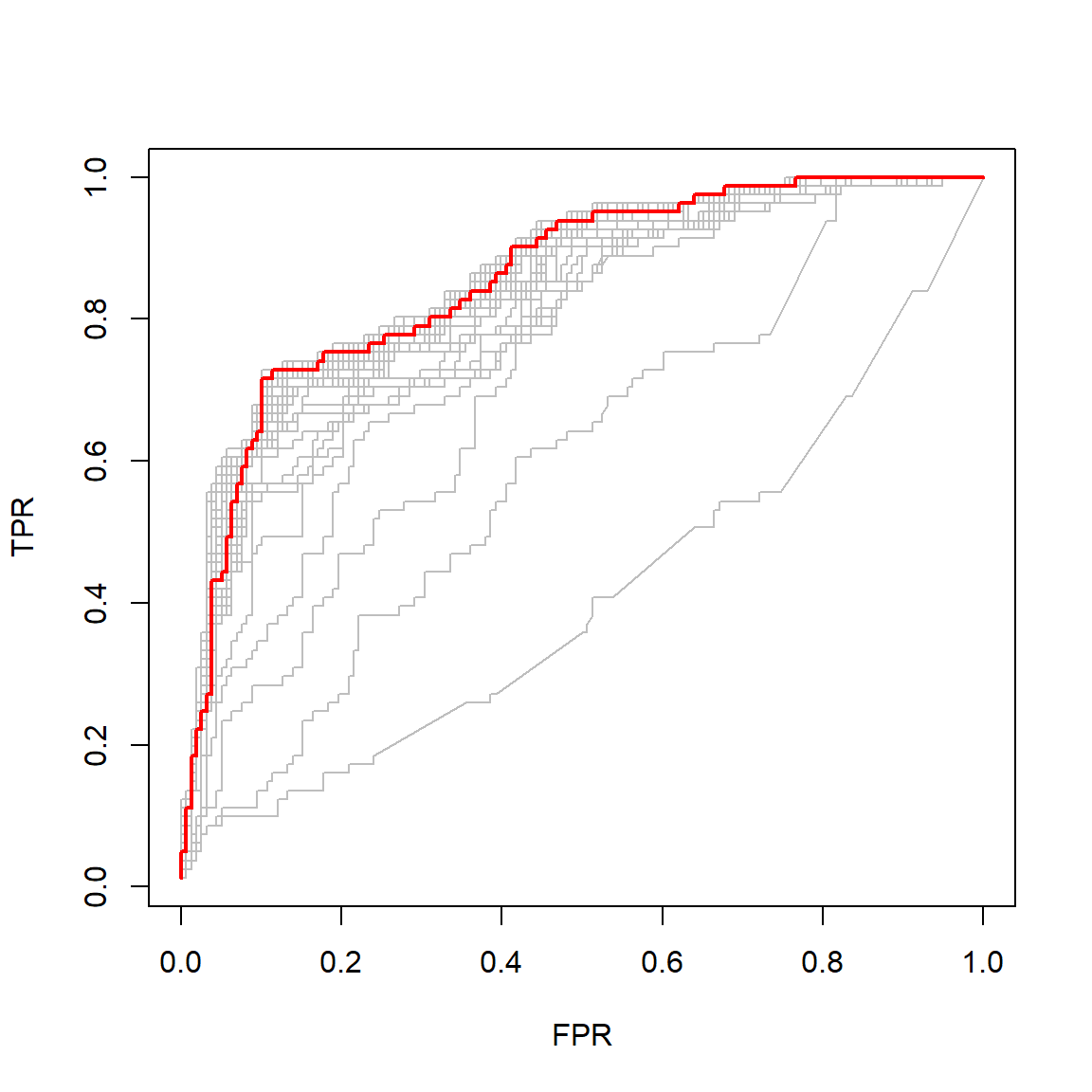
Figure 4.9: Cross-validated ROC curves for varying \(L_1\) logistic regression regularisation penalties. The curve with the largest AUC is indicated in red.
However, the resulting model corresponds to a relatively small penalty, only dropping four variables from the model (retaining sex), although the other two included variables have very small coefficients:
## 18 x 1 sparse Matrix of class "dgCMatrix"
##                          lambda.min
## (Intercept)                   9.929
## age                           0.034
## anaemia0                      .
## anaemia1                      .
## creatinine_phosphokinase      0.000
## diabetes0                     .
## diabetes1                     .
## ejection_fraction            -0.050
## high_blood_pressure0          .
## high_blood_pressure1          .
## platelets                     0.000
## serum_creatinine              0.469
## serum_sodium                 -0.072
## sex0                          0.294
## sex1                          0.000
## smoking0                      .
## smoking1                      .
## time                         -0.016
We now have three logistic regression models of varying complexity: the full model8 (containing some unnecessary variables), the 5-variable model (regularised according to CV accuracy), and the 8-variable model (regularised according to CV AUC). At this point, one would need to select one of these models to use on the test set. If the goal is classification accuracy, then we would use the 5-variable model. However, for the sake of this example we will apply all three models to the test set and compare their performance across a few metrics.
x_test <- select(heart, -DEATH_EVENT) %>% slice(-train) #predict.glm requires matrix
x_test_dummies <- makeX(x_test)            #with dummy variables
y_test <- heart$DEATH_EVENT[-train]

pred_full <- predict(heart_lr, newdata = heart[-train, ], type = 'response') #response for p(x)
pred_l1_acc <- predict(heart_l1_cv, x_test_dummies, s = 'lambda.min', type = 'response')[,1] #default output is matrix
pred_l1_auc <- predict(auc_cv, x_test_dummies, s = 'lambda.min', type = 'response')[,1]

# Write a function for calculating all the desired metrics from a model's predicted probs
my_metrics <- function(pred, labs){
  p_labs <- round(pred) #Threshold 0.5
  t <- table(p_labs, labs)
  acc <- mean(p_labs == labs) #accuracy
  rec <- recall(t, '1')       #from caret
  sp <- specificity(t, '0')   #ditto
  pr <- precision(t, '1')     #ditto
  f1 <- F_meas(t, '1')        #ditto
  auc <- performance(prediction(pred, labs), 'auc')@y.values[[1]] #from ROCR
  metrics <- c('Accuracy' = acc,
               'Recall' = rec,
               'Specificity' = sp,
               'Precision' = pr,
               'F1' = f1,
               'ROC AUC' = auc)
  return(metrics)
}

heart_results <- rbind('Vanilla LR' = my_metrics(pred_full, y_test),
                       'L1 LR (CV accuracy)' = my_metrics(pred_l1_acc, y_test),
                       'L1 LR (CV AUC)' = my_metrics(pred_l1_auc, y_test))

heart_results %>% kable(digits = 3, caption = 'Comparison of model performance on the heart failure test set. The vanilla logistic regression model used all 12 features; the models regularised according to accuracy and AUC contained 5 and 8 features, respectively.')| Accuracy | Recall | Specificity | Precision | F1 | ROC AUC | |
|---|---|---|---|---|---|---|
| Vanilla LR | 0.833 | 0.800 | 0.844 | 0.632 | 0.706 | 0.899 |
| L1 LR (CV accuracy) | 0.867 | 0.667 | 0.933 | 0.769 | 0.714 | 0.944 |
| L1 LR (CV AUC) | 0.850 | 0.800 | 0.867 | 0.667 | 0.727 | 0.939 |
Both approaches to the regularisation improved the results from the baseline vanilla logistic regression across all metrics with the exception of recall, which is arguably the most important metric for death events! None of the models could correctly predict more than 80% of the observed deaths. Whilst the model maximising CV accuracy did indeed yield the highest accuracy on the test set, it correctly identified only two-thirds of death events, again illustrating the danger of focusing solely on accuracy even with mildly imbalanced data. This model actually produced a marginally better test AUC than the model fitted to maximise AUC, although the latter model did yield the best F1 score.
However, due in part to the relatively small size of this problem, the differences in results were relatively small. It should also be highlighted once more that there is some notable sampling variability, both in the train/test split and the cross-validation. In fact, Chicco & Jurman (2020) presented their results, across a variety of models and metrics, as the averages of 100 results from randomised train/test splits. Replicating this as well as repeated CV sampling are left as homework exercises.
In the following chapters we will move away from the linear class of models, considering some parametric and non-parametric approaches to modelling non-linearity.
4.4 Homework exercises
Show that for binary classification, the logistic regression decision boundary corresponding to the classification rule \(\hat{p}(\boldsymbol{X}) \geq 0.5\) is given by the set of points in the predictor space for which the odds are equal to 1.
For Example 3 (Default data), create an animation showing how the decision boundary in Figure 4.4 shifts as the decision threshold \(\tau\) is varied from 0 to 1 (both excluded).
Replicate the methodology of Chicco & Jurman (2020) by repeating the modeling done in Example 4 100 times. Draw a boxplot for each metric across the 100 runs for each of the three models and report the averages.
Continuing with Example 4: For a single train/test split, repeat the cross-validated regularisation (using both accuracy and AUC) 100 times and again visualise the resulting metrics via boxplots. Now repeat this procedure for 100 random train/test splits, whilst in each iteration keeping track of the mean and standard deviation of each metric across the 100 CV runs. How do the boxplots for the means compare to your results in Question 2?
Imbalanced data refers to a dataset where the distribution of target classes is not uniform, i.e. there are significantly more observations with labels from the majority class(es) than the minority class(es).↩︎
This model – using all the predictors without any constraints and applying the default settings – is often colloquially referred to as the “vanilla” model.↩︎