Chapter 5 Non-Linear Models
The regression and classification models we considered in the previous two chapters were predicated on the assumption – even after applying regularisation – that the input variables map linearly to the response. In reality, this will usually be an approximation at best, and wildly over simplistic at worst. Therefore, although these models offer clear interpretation and inference, this often comes at the cost of predictive power.
As we saw in chapter 2, we can increase a model’s flexibility in an attempt to decrease the bias component of the error, although we must again be cognizant of the fact the increased variance will eventually offset this gain. Some of the possible non-linear modelling approaches are polynomial regression, step functions, regression and smoothing splines, multivariate adaptive regression splines (MARS), local regression methods, and generalised additive models (GAMs). There are many more, and these are just the parametric techniques!
In this chapter we will only cover one parametric approach in polynomial regression and a simple non-parametric approach in K-nearest neighbours (KNN). Tree-based methods (including ensembling), another powerful non-parametric approach for both regression and classification, will be left for the final chapter. The reader is encouraged to explore some of the other aforementioned techniques in chapter 7 of James et al. (2013).
5.1 Polynomial regression
Polynomial regression is simply a type of multiple regression in which the relationship between the independent variable(s) and the dependent variable is modelled as an \(d^{th}\)-degree polynomial. In contrast to linear regression, where the relationship is modeled as a straight line/hyperplane, polynomial regression allows us to capture more complex, non-linear relationships between variables. Note that linear regression is the simplest case of polynomial regression, i.e. 1st-degree.
This approach can be applied to both regression (multiple linear regression) and classification problems (logistic regression).
5.1.1 Regression
The polynomial regression model for a single predictor variable can be represented as follows:
\[\begin{equation} Y = \beta_0 + \beta_1X + \beta_2X^2 + \beta_3X^3 + \cdots + \beta_dX^d + \epsilon. \tag{5.1} \end{equation}\]By selecting an appropriate degree for the polynomial, we can capture different types of nonlinear relationships. As we have seen previously though, using a degree that is too high yields an overly complex model that will overfit on the training data. In practice it is unusual to use \(d > 4\), since these highly flexible models can perform especially poorly near the boundaries of the observed predictors.
Let us illustrate the application via an example.
5.1.2 Example 5 – Auto
We will consider the well-known Auto dataset, available in the ISLR package, which contains measurements on the mileage, engine specifications, and manufacturing information for 392 vehicles. A sensible relationship to model is how a vehicle’s mileage depends on its specifications.
First, visually explore the relationships between the numeric variables. One could do so quickly using the pairs() function, although the ggplot version offers more options for customisation.
library(ISLR)
library(GGally)
library(dplyr)
data(Auto)

#Origin is categorical (as is name, but we will exclude this)
Auto$origin <- as.factor(Auto$origin)
levels(Auto$origin) <- c('US', 'Euro', 'Japan')

Auto %>% select(-c(name, year)) %>%
  ggpairs(mapping = aes(colour = origin, alpha = 0.5), legend = 1) +
  scale_alpha_identity()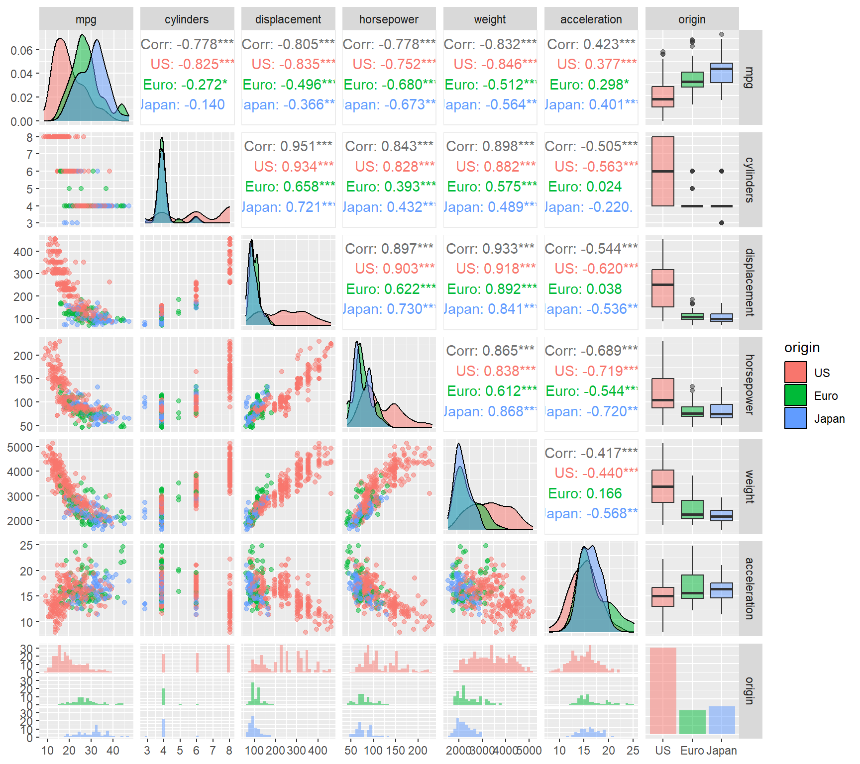
Figure 5.1: Exploratory plot for the Auto dataset
Since we are interested in the relationship between miles per gallon (mpg) and the other covariates, the focus is on the left-most column in Figure 5.1. There are clear inverse relationships between mileage and displacement, horsepower, and weight, although neither of these seem to be linear, especially for American vehicles9. We do not require a highly flexible function to model these variables either; a quadratic polynomial will suffice.
For example, consider first the horsepower variable. Although this feature is highly significant in a linear model, the quadratic fit captures a higher proportion of the variation in the data. Here we use the stargazer package to print both models’ results for comparison.
library(modelsummary)
library(gt)

# Linear fit
mod1 <- lm(mpg ~ horsepower, data=Auto)
mod2 <- lm(mpg ~ poly(horsepower, 2, raw = T), data=Auto)
# This is the same as lm(mpg ~ horsepower + I(horsepower^2), data=Auto)
# Using raw=F (the default) yields orthogonal polynomials

modelsummary(
  models = list(
    'Linear' = mod1,
    'Quadratic' = mod2
  ),
  statistic = "p.value",
  stars = FALSE,
  digits = 3,
  output = 'gt',
  title = 'Linear vs quadratic model results for the Auto dataset, using only horsepower'
)| Linear | Quadratic | |
|---|---|---|
| (Intercept) | 39.936 | 56.900 |
| (<0.001) | (<0.001) | |
| horsepower | -0.158 | |
| (<0.001) | ||
| poly(horsepower, 2, raw = T)1 | -0.466 | |
| (<0.001) | ||
| poly(horsepower, 2, raw = T)2 | 0.001 | |
| (<0.001) | ||
| Num.Obs. | 392 | 392 |
| R2 | 0.606 | 0.688 |
| R2 Adj. | 0.605 | 0.686 |
| AIC | 2363.3 | 2274.4 |
| BIC | 2375.2 | 2290.2 |
| Log.Lik. | -1178.662 | -1133.177 |
| F | 599.718 | 428.018 |
| RMSE | 4.89 | 4.36 |
In Figure 5.2 we can clearly see that the quadratic fit (red line) captures the shape of the data better than the linear model (gray line), especially at the boundaries. However, note that we include the lower degree terms in the polynomial regression model as well – in this case the linear term alone – to capture these components in the data too.
# Plot mpg vs horsepower
plot(mpg ~ horsepower, data = Auto, pch = 16, col= 'darkblue')

# Add fits
x_axs <- seq(min(Auto$horsepower), max(Auto$horsepower), length = 100)
lines(x_axs, predict(mod1, data.frame(horsepower = x_axs)), col = 'darkgrey')
lines(x_axs, predict(mod2, data.frame(horsepower = x_axs)), col = 'red')

# Calculate 95% confidence intervals around fits
CI_1 <- predict(mod1, data.frame(horsepower = x_axs),
                interval = 'confidence', level = 0.95)
CI_2 <- predict(mod2, data.frame(horsepower = x_axs),
                interval = 'confidence', level = 0.95)

# And add to plot
matlines(x_axs, CI_1[, 2:3], col = 'darkgrey', lty = 2)
matlines(x_axs, CI_2[, 2:3], col = 'red', lty = 2)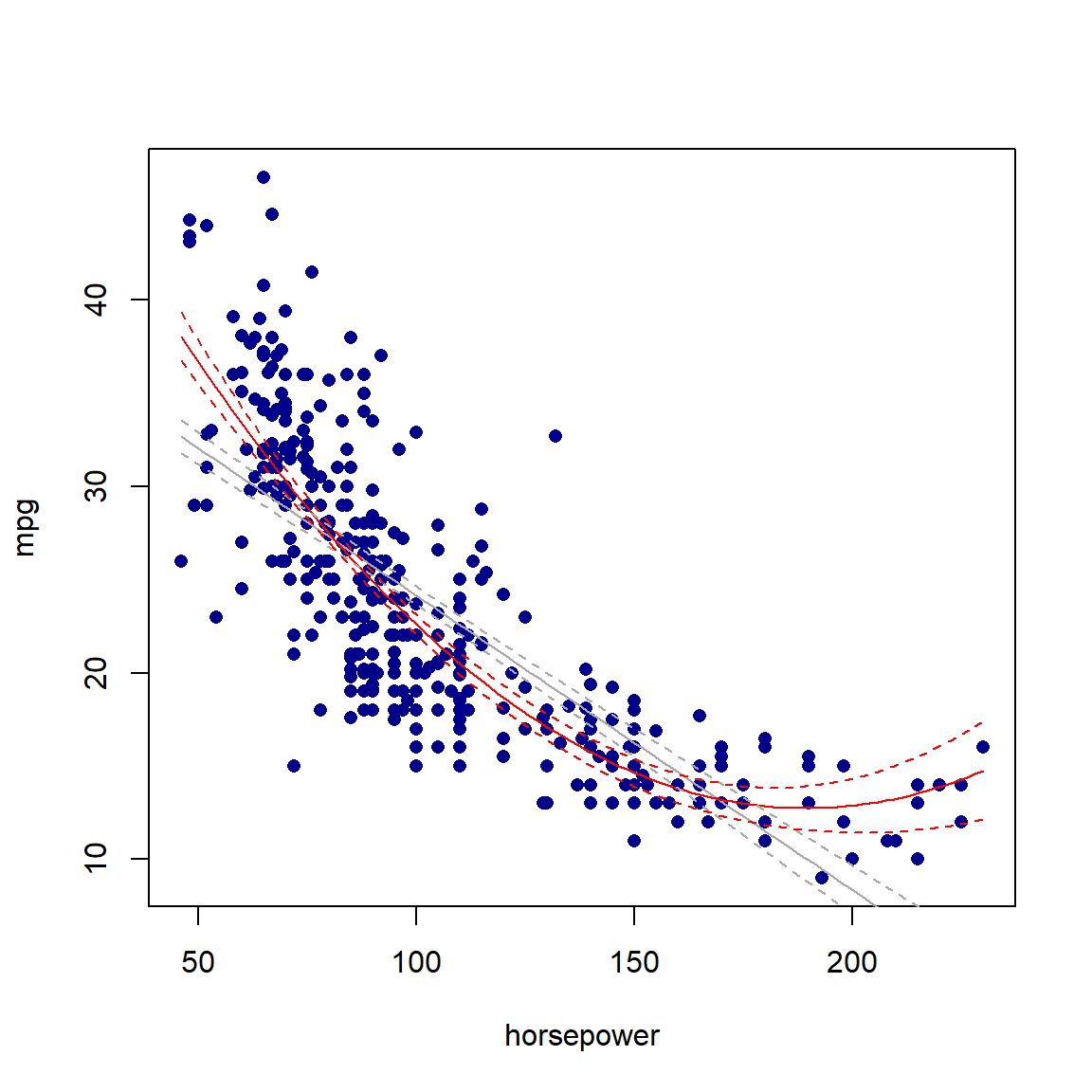
Figure 5.2: Linear (gray) and quadratic (red) fits for the Auto dataset, using only horsepower. 95% confidence intervals are indicated with dashed lines.
One could now add the rest of the variables in the model, although the extreme collinearity will result in only some of them being included in the final model after applying variable selection/regularisation. This is left as an exercise.
Before moving on to a localised approach, we note that polynomial regression can also be applied to classification problems.
5.1.3 Classification
In the previous chapter we saw that the logistic regression model yielded linear decision boundaries since the logit is linear in \(\boldsymbol{X}\). To create non-linear decision boundaries, we simply add the polynomial terms to the logit in Equation 4.2:
\[\begin{equation} \log \left( \frac{p(X)}{1 - p(X)} \right) = \beta_0 + \beta_1X + \beta_2X^2 + \beta_3X^3 + \cdots + \beta_dX^d, \tag{5.2} \end{equation}\]for only a single predictor \(X\). More variables can be added to the model in a similar fashion.
We will once again illustrate this by means of an example, by returning to the heart failure dataset first seen in section 4.3.1.
5.1.4 Example 4 – Heart failure (continued)
For illustration purposes we will focus on two of the numeric predictors, namely age and ejection_fraction. Fitting a linear logistic regression model on the entire dataset using only these two variables yields the decision boundary displayed in 5.3:
# Read in the data and turn the categorical features to factors
heart <- read.csv('data/heart.csv', header = TRUE,
                  colClasses = c(anaemia='factor',
                                 diabetes = 'factor',
                                 high_blood_pressure = 'factor',
                                 sex = 'factor',
                                 smoking = 'factor',
                                 DEATH_EVENT = 'factor'))

# Fit logistic regression (linear)
lin_log <- glm(DEATH_EVENT ~ age + ejection_fraction,
               data = heart, family = 'binomial')

cfs1 <- coef(lin_log) #Extract coefficients

# Plot Age vs Ejection fraction
plot(heart$age, heart$ejection_fraction,
     col = ifelse(heart$DEATH_EVENT == '1', 'darkorange', 'lightblue'),
     pch = ifelse(heart$DEATH_EVENT == '1', 3, 1),
     xlab = 'Age', ylab = 'Ejection fraction')
legend('topright', c('Death', 'Survival'),
       col = c('darkorange', 'lightblue'),
       pch = c(3, 1))

# Add the decision boundary
abline(-cfs1[1]/cfs1[3], -cfs1[2]/cfs1[3], col = 'navy', lwd = 2)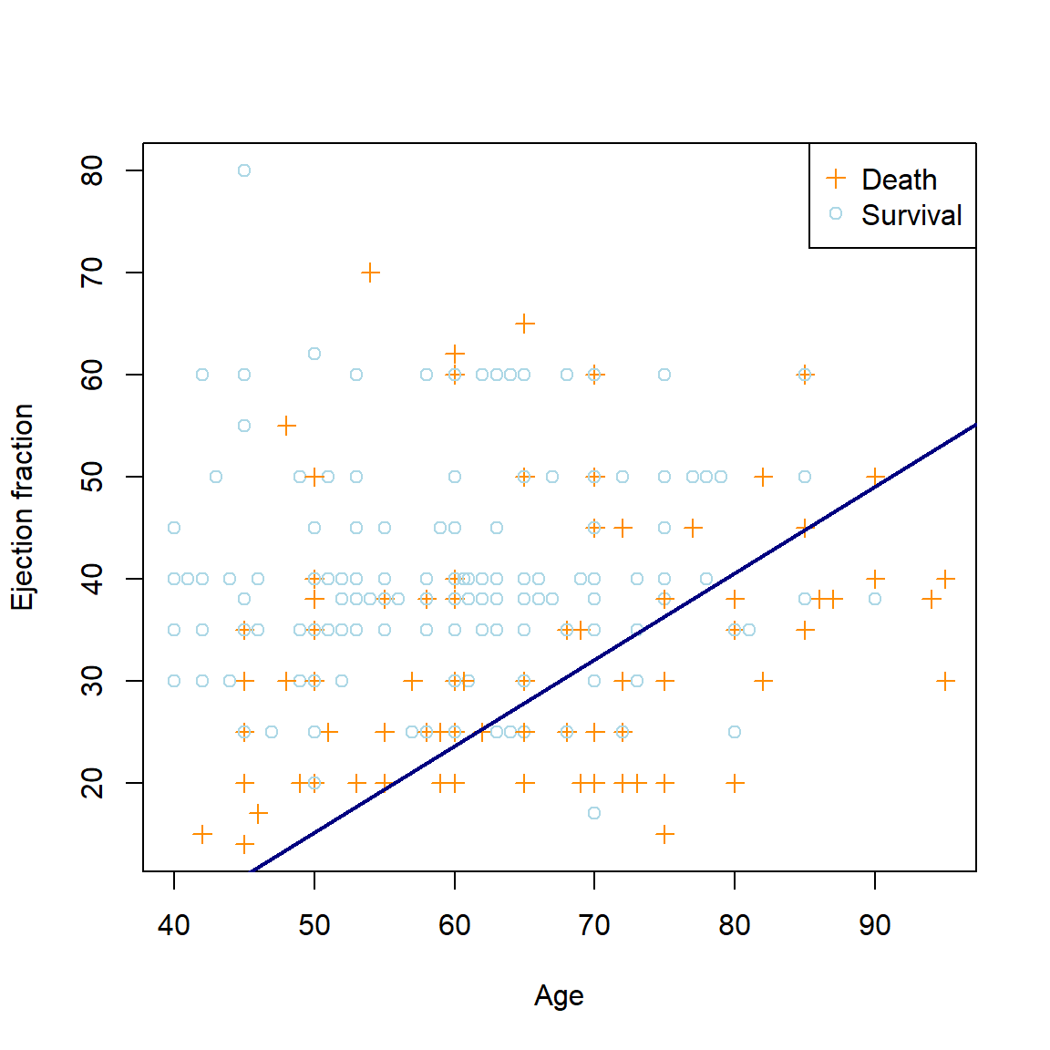
Figure 5.3: The linear logistic regression decision boundary for the heart failure dataset using age and ejection fraction as predictors.
Let us now propose a more flexible model:
\[\begin{equation} \log \left( \frac{p(\boldsymbol{X})}{1 - p(\boldsymbol{X})} \right) = \beta_0 + \beta_1\text{Age} + \beta_2\text{Age}^2 + \beta_3\text{Age}^3 + \beta_4\text{Age}^4 + \beta_5\text{EjectionFraction}, \end{equation}\]The resulting non-linear decision boundary can be seen in Figure 5.4.
# Fit logistic regression with 5th degree on age + serum_creatinine
poly_log <- glm(DEATH_EVENT ~ age + I(age^2) + I(age^3) + I(age^4) + ejection_fraction,
                data = heart, family = 'binomial')

cfs4 <- coef(poly_log) #Extract coefficients

# Plot age vs ejection fraction
plot(heart$age, heart$ejection_fraction,
     col = ifelse(heart$DEATH_EVENT == '1', 'darkorange', 'lightblue'),
     pch = ifelse(heart$DEATH_EVENT == '1', 3, 1),
     xlab = 'Age', ylab = 'Ejection fraction')
legend('topright', c('Death', 'Survival'),
       col = c('darkorange', 'lightblue'),
       pch = c(3, 1))

# And add decision boundary
xx <- seq(min(heart$age), max(heart$age), length.out = 100)
lines(xx, (cbind(1, xx, xx^2, xx^3, xx^4) %*% cfs4[-6])/-cfs4[6], #again, do the math!
      col = 'navy', lwd = 2)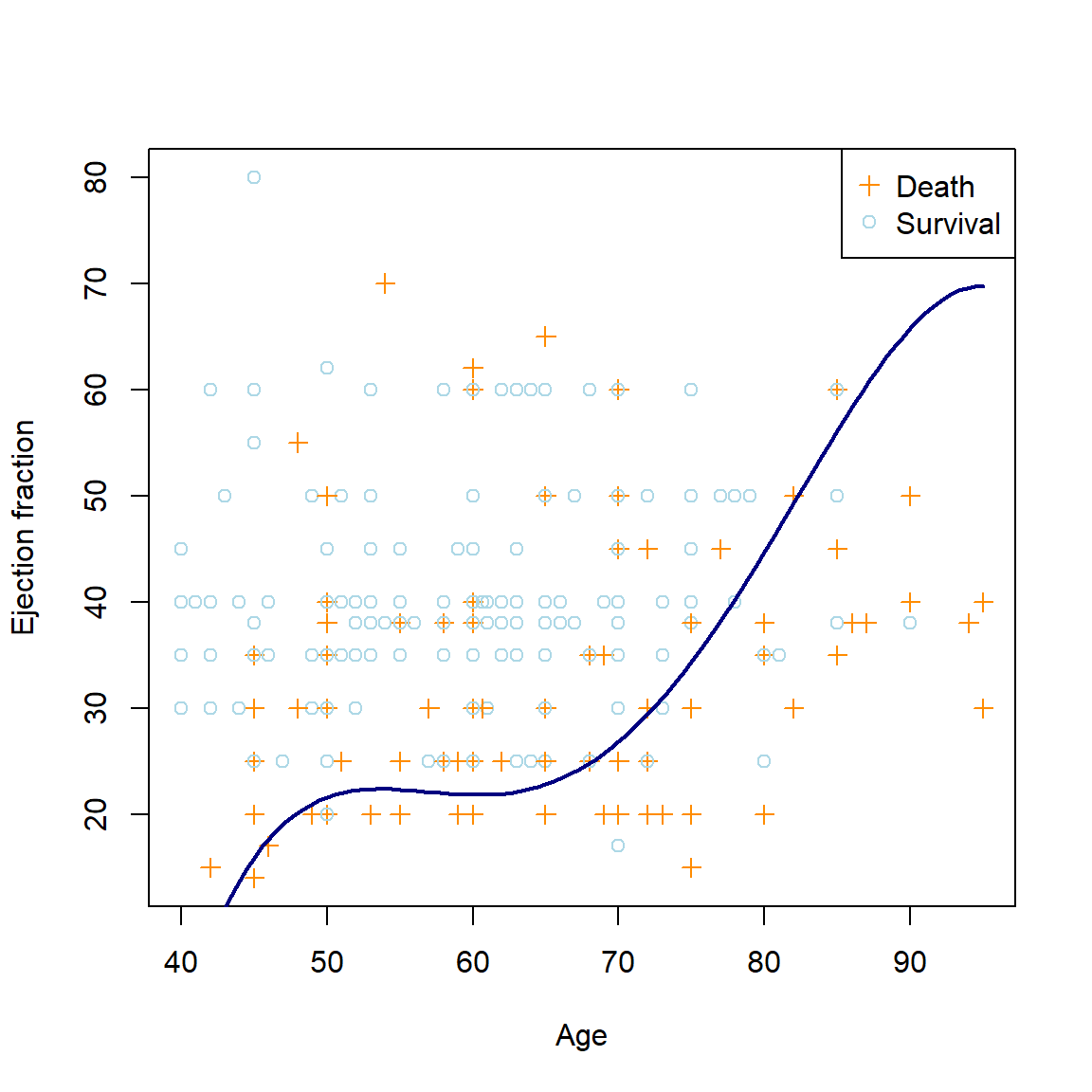
Figure 5.4: The polynomial logistic regression decision boundary for the heart failure dataset using age4 and ejection fraction as predictors.
Of course we know that increased complexity does not necessarily imply improved fit or prediction. As with any other model, we would need to use out-of-sample data to determine whether this model better captures the underlying relationship in the data, whilst again considering what constitutes an ideal fit for the problem, i.e. weighing the asymmetric cost of misclassification. This is once again left as an exercise for the reader.
To limit the scope of this section of the course, we will end our discussion on non-linear parametric models here, with a brief addendum:
5.1.5 Extension to basis functions and generalised additive models
Although polynomial regression is a valuable tool for capturing nonlinear relationships, it has its limitations, especially when dealing with complex data patterns. To address these limitations and provide more flexible modelling options, one can apply a more general basis function approach, where any family of functions or transformations are applied to the features.
These functions can also be fitted piecewise (locally), defining splines, which are generally smoothed to be piecewise continuous and linear at the boundaries.
Finally, Generalised Additive Models (GAMs) are a powerful extension of linear regression that allow for the modeling of complex interactions and nonlinear relationships without relying on a single global polynomial. They are particularly useful when dealing with high-dimensional data and when you want to capture intricate relationships between predictors and the target.
As with polynomial regression, these methods can be applied in both regression and classification contexts.
5.2 K-Nearest Neighbours
K-Nearest Neighbours (KNN) is a simple non-parametric algorithm that can perform surprisingly well in various contexts. At its core, KNN makes predictions based on the similarity between data points. It operates on the premise that similar data points tend to belong to the same class (in classification) or have similar target values (in regression).
During the training phase, KNN stores the entire dataset in memory. No explicit model is constructed and no parameters are learned – the training phase simply involves memorising the data.
When making a prediction for a new, unseen data point, KNN looks at the \(K\) nearest data points from the training dataset, where \(K\) is a user-defined hyperparameter. Euclidean distance is generally employed as distance metric, although other measurements such as Manhattan distance and the Minkowski distance (of which the Euclidean distance is a special case) can also be used.
We will again consider these output separately for regression and classification tasks.
5.2.1 Regression
Consider a continuous target variable. Given a value for \(K\) and a prediction point \(\boldsymbol{x}_0\), KNN regression identifies the \(K\) training observations that are closest to \(\boldsymbol{x}_0\), for now we will assume according to Euclidean distance. Denote these observations by \(\mathcal{N}_0\).
We then simply estimate \(f(\boldsymbol{x}_0)\) as the average of the training responses in \(\mathcal{N}_0\). Therefore,
\[\begin{equation} \hat{f}(\boldsymbol{x}_0) = \frac{1}{K}\sum_{\boldsymbol{x}_i \in \mathcal{N}_0} y_i. \tag{5.3} \end{equation}\]The choice of \(K\) once again amounts to deciding on the flexibility of the decision boundary, as illustrated in the following example:
5.2.2 Example 2 – Prostate cancer (continued)
Consider again the prostate cancer dataset from Chapter 3. We will focus on the variable that was least significant in the saturated model, namely age. Although the KNN algorithm is relatively simple to code from scratch, we will use the knnreg() function from the caret package.
library(caret)

dat_pros <- read.csv('data/prostate.csv')

# Extract train and test examples and drop the indicator column
train_pros <- dat_pros[dat_pros$train, -10]
test_pros <- dat_pros[!dat_pros$train, -10]

# KNN reg with k = 3 and k = 10
knn3 <- knnreg(lpsa ~ age, train_pros, k = 3)
knn10 <- knnreg(lpsa ~ age, train_pros, k = 10)

# Range of xs and predictions (fitted "curve")
xx <- min(train_pros$age):max(train_pros$age) #Integer variable
knn3_f <- predict(knn3, data.frame(age = xx))
knn10_f <- predict(knn10, data.frame(age = xx))

# Plots
par(mfrow=c(1,2))
for(i in 1:length(xx)){
  # Need the distances just for illustration
  f <- cbind(c(xx[i], train_pros$age), c(knn3_f[i], train_pros$lpsa))
  dists <- dist(f)[1:nrow(train_pros)]
  dist_ords <- order(dists)

  # Left plot (k = 3)
  plot(lpsa ~ age, train_pros, pch = 16, col = 'navy', main = 'KNN regression with K = 3')
  lines(xx[1:i], knn3_f[1:i], type = 's')
  segments(max(xx)*2, knn3_f[i], xx[i], knn3_f[i], lty = 3)
  mtext(substitute(hat(y) == a,
                   list(a = round(knn3_f[i], 1))),
        4, at = knn3_f[i], padj = 0.5)
  segments(train_pros$age[dist_ords[1:3]], train_pros$lpsa[dist_ords[1:3]],
           xx[i], knn3_f[i], col = 'darkgrey')

  # Right plot (k = 10)
  plot(lpsa ~ age, train_pros, pch = 16, col = 'navy', main = 'KNN regression with K = 10')
  lines(xx[1:i], knn10_f[1:i], type = 's')
  segments(max(xx)*2, knn10_f[i], xx[i], knn10_f[i], lty = 3)
  mtext(substitute(hat(y) == a,
                   list(a = round(knn10_f[i], 1))),
        4, at = knn10_f[i], padj = 0.5)
  segments(train_pros$age[dist_ords[1:10]], train_pros$lpsa[dist_ords[1:10]],
           xx[i], knn10_f[i], col = 'darkgrey')
}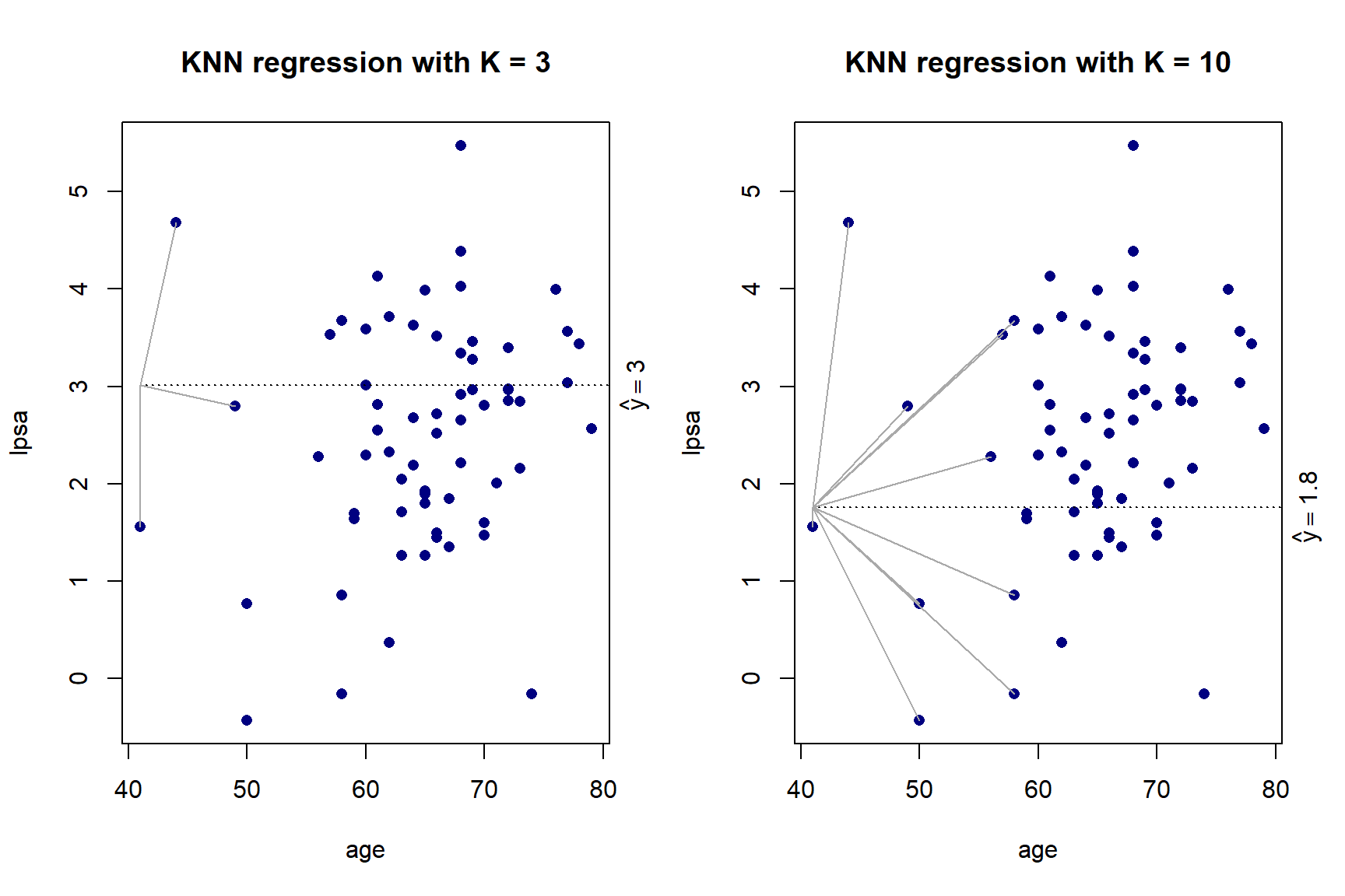
Figure 5.5: KNN regression with \(K\) = 3 and \(K\) = 10 on the prostate cancer dataset, using only age
As we can see in Figure 5.5, there is more volatility in the fit for smaller values of \(K\). To further illustrate this, Figure 5.6 shows the different fits as \(K\) changes.
for(k in 1:20){
  knn_fit <- knnreg(lpsa ~ age, train_pros, k = k)
  knn_f <- predict(knn_fit, data.frame(age = xx))
  plot(lpsa ~ age, train_pros, pch = 16, col = 'navy', main = paste0('KNN regression with k = ', k))
  lines(xx, knn_f, type = 's')
}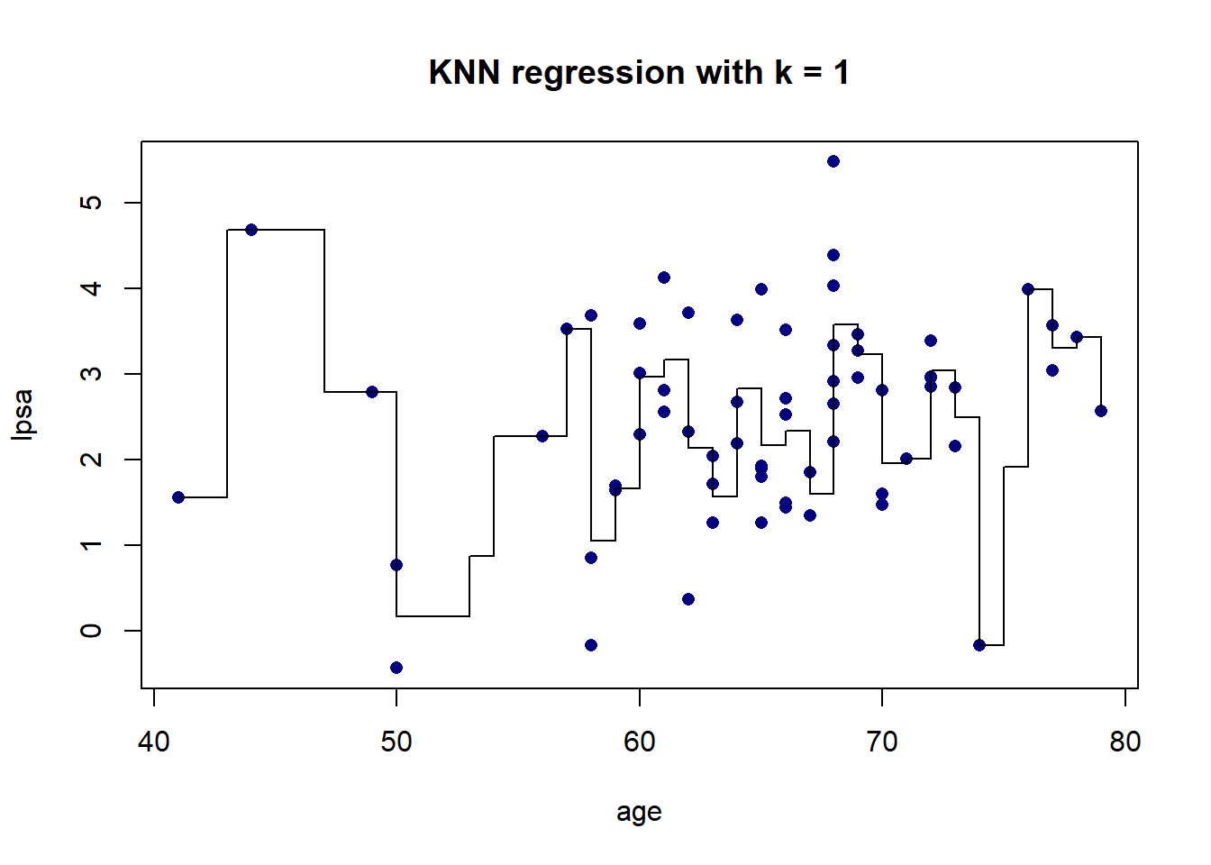
Figure 5.6: KNN regression on the prostate cancer dataset, using only age, for varying values of \(K\)
The resulting fit is a stepped function, which becomes a stepped surface when increasing the dimensionality, as can be seen in Figure 5.7 when adding lbph to the model and fitting a KNN regression with \(K = 3\).
library(plotly)

# Fit
knn3_2d <- knnreg(lpsa ~ age + lbph, train_pros, k = 3)

# Surface
xx1 <- min(train_pros$age):max(train_pros$age)
xx2 <- seq(min(train_pros$lbph), max(train_pros$lbph), length.out = length(xx1))
fgrid <- expand.grid(age = xx1, lbph = xx2)
f <- predict(knn3_2d, fgrid)
z <- matrix(f, nrow = length(xx1), byrow = T)

# Plot
fig <- plot_ly(x = ~xx1, y = ~xx2, z = ~z, type = 'surface', showscale = F) %>%
  add_markers(x = train_pros$age, y = train_pros$lbph, z = train_pros$lpsa,
              inherit = F, showlegend = F, marker = list(size = 5,
                                                         color = 'magenta')) %>%
  layout(scene = list(
    xaxis = list(title = 'Age'),
    yaxis = list(title = 'LBPH'),
    zaxis = list(title = 'LPSA')
  ))
fig
Figure 5.7: KNN regression with \(K\) = 3 applied to the prostate cancer dataset, using age and lbph
Now, \(K = 3\) was chosen arbitrarily here, hence the question again arises of which value of \(K\) to use, i.e. what our model complexity should be. Once again we will make use of cross-validation to fit and validate models of varying complexity. We will now introduce the caret package as a tool for performing this hyperparameter tuning.
One of the drawbacks of KNN is that there is no sensible way of determining how much a specific variable contributes towards explaining the variance in the target variable, which makes feature selection a difficult, often trial-and-error process. Since we have relatively few observations in this dataset, we will only use 3 predictors – the last 3 predictors that remain in the lasso model – namely lcavol, lweight, and svi.
Also, since the dataset is so small, we will repeat the CV procedure 10 times and average over the results.
# See names(getModelInfo()) for a list of algorithms in caret

# This is where one would specify combinations of hyperparameters
knn_grid <- expand.grid(k = 3:15)
# knn only only has one: k. See getModelInfo()$knn$parameters

# Specify the CV procedure
ctrl <-  trainControl(method = 'repeatedcv', number = 10, repeats = 10)

# Use train() to fit all the models
set.seed(4026)
knn_cv <- train(lpsa ~ lcavol + lweight + svi,
                data = train_pros,
                method = 'knn',
                trControl = ctrl,
                tuneGrid = knn_grid)

# Plot results
plot(knn_cv) 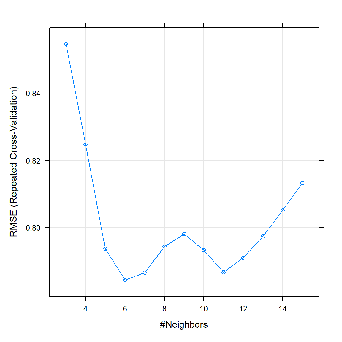
Figure 5.8: Repeated CV results for KNN as applied to the prostate cancer dataset.
As can be seen in 5.8, the best KNN model according to the CV procedure (lowest RMSE) is one with \(K = 6\). Remember that for this model, lower \(K\) increases flexibility, therefore the model starts overfitting for \(K\) smaller than 6. Now we use this model to predict on the test set.
test_y <- test_pros[, 9]

knn_pred <- predict(knn_cv, test_pros)
(knn_mse <- round(mean((test_y - knn_pred)^2), 3))
## [1] 0.39The testing MSE of 0.39 is actually noticeably better than our best regularised linear model, which yielded an MSE of 0.45. Testing other combinations of features, which could possibly improve the results further, is left as a homework exercise.
Finally, we will apply KNN in a classification setting.
5.2.3 Classification
The training setup in the classification setting is exactly the same as for regression. Let the target \(Y \in \{1, 2, \ldots, J\}\) and again denote the \(K\) training observations closest to \(\boldsymbol{x}_0\) as \(\mathcal{N}_0\). The KNN classifier then simply estimates the conditional probability for class \(j\) as the proportion of points in \(\mathcal{N}_0\) whose response values equal \(j\):
\[\begin{equation} \Pr(Y=j|\boldsymbol{X} = \boldsymbol{x}_0) = \frac{1}{K}\sum_{\boldsymbol{x}_i \in \mathcal{N}_0} I(y_i = j). \tag{5.4} \end{equation}\]To illustrate this, we will again return to the heart failure dataset.
5.2.4 Example 4 – Heart failure (continued)
To illustrate the decision boundary resulting from the KNN classifier, consider again the predictors age and ejection_fraction. We will use the class package’s knn() function, although note that many other packages provide the same functionality.
library(class)

xx1 <- min(heart$age):max(heart$age)
xx2 <- min(heart$ejection_fraction):max(heart$ejection_fraction)

fgrid <- expand.grid(age = xx1, ejection_fraction = xx2)

tr <- select(heart, age, ejection_fraction)

# Fit KNN with k = 3
knn3_class <- knn(tr, fgrid, heart$DEATH_EVENT, k = 3)
knn10_class <- knn(tr, fgrid, heart$DEATH_EVENT, k = 10)
fgrid$f3 <- knn3_class
fgrid$f10 <- knn10_class

#Animation taking too long...Something for future
# fitmat_3 <- matrix(knn3_class, nrow = length(xx1), byrow = T)
# fitmat_10<- matrix(knn10_class, nrow = length(xx1), byrow = T)
# for(i in 1:length(xx1)){
#   for(j in 1:length(xx2)){
#     # Plot age vs ejection fraction
#     plot(heart$age, heart$ejection_fraction,
#          col = ifelse(heart$DEATH_EVENT == '1', 'darkorange', 'lightblue'),
#          pch = ifelse(heart$DEATH_EVENT == '1', 3, 1),
#          xlab = 'Age', ylab = 'Ejection fraction', main = 'KNN classification with K = 3')
#
#     points(xx1[i], xx2[j], pch = 15,
#            col = ifelse(fitmat_3[i,j] == 1,
#                         rgb(255, 140, 0, maxColorValue = 255, alpha = 255*0.4),
#                         rgb(173, 216, 230, maxColorValue = 255, alpha = 255*0.4)))
#     segments(xx1[i], min(xx2)/2, xx1[i], xx2[j], lty = 3)
#     segments(min(xx1)/2, xx2[j], xx1[i], xx2[j], lty = 3)
#   }
# }

par(mfrow = c(1, 2))

# K = 3
plot(heart$age, heart$ejection_fraction,
     col = 'black',
     pch = ifelse(heart$DEATH_EVENT == '1', 3, 1),
     xlab = 'Age', ylab = 'Ejection fraction', main = 'KNN classification with K = 3')

points(fgrid$age, fgrid$ejection_fraction, pch = 15,
       col = ifelse(fgrid$f3 == 1,
                    rgb(255, 140, 0, maxColorValue = 255, alpha = 255*0.25),
                    rgb(173, 216, 230, maxColorValue = 255, alpha = 255*0.25)))

# K = 10
plot(heart$age, heart$ejection_fraction,
     col = 'black',
     pch = ifelse(heart$DEATH_EVENT == '1', 3, 1),
     xlab = 'Age', ylab = 'Ejection fraction', main = 'KNN classification with K = 10')

points(fgrid$age, fgrid$ejection_fraction, pch = 15,
       col = ifelse(fgrid$f10 == 1,
                    rgb(255, 140, 0, maxColorValue = 255, alpha = 255*0.25),
                    rgb(173, 216, 230, maxColorValue = 255, alpha = 255*0.25)))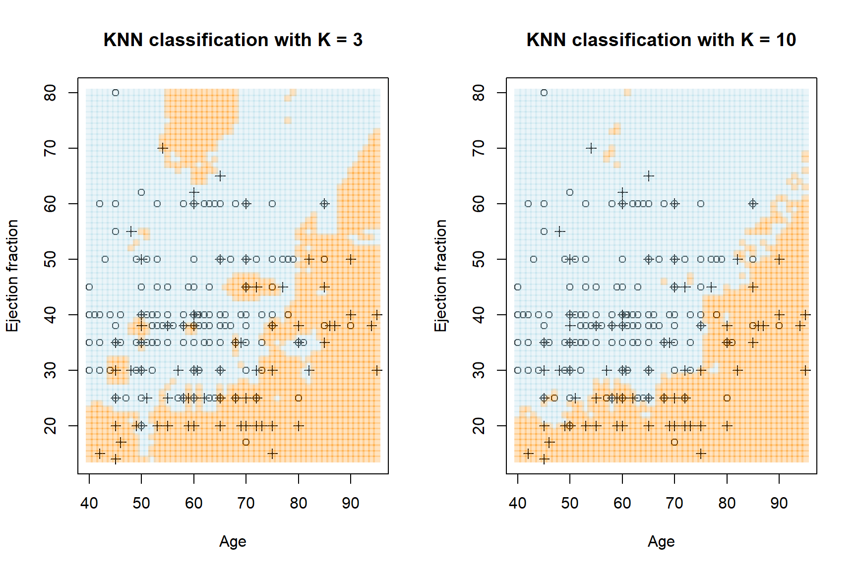
Figure 5.9: KNN regression with \(K\) = 3 and \(K\) = 10 on the heart failure dataset, using age and ejection fraction. Crosses are observed deaths, circles are survivals. The orange regions pertain to predicted death, the blue to predicted survival.
Figure 5.9 shows highly flexible decision boundaries, which clearly fit local noise especially when \(K\) is small. As before, we can use CV to determine the ideal complexity according to an appropriate model evaluation metric. This is left as a homework exercise.
As we have seen, there are several advantages and disadvantages to using KNN.
Advantages:
- It is a very simple algorithm to understand and implement, for both regression and multiclass classification.
- It does not make assumptions about the decision boundaries, allowing it to capture non-linear relationships between features.
- It does not make assumptions about the distribution of the data, making it suitable for a wide range of problems.
Disadvantages:
- It requires a lot of memory and is computationally expensive for large and complex datasets.
- It is not suitable for imbalanced data (classification), as it is biased towards the majority class.
- In regression contexts it is sensitive to outliers, especially for smaller \(K\).
- There are no neat ways of measuring variable importance or performing feature selection.
- It performs particularly poorly on very noisy data.
- It requires a lot of data for high-dimensional problems, suffering severely from the curse of dimensionality.
In the final chapter, we will encounter another potentially powerful family of heuristics by exploring tree-based methods.
5.3 Homework exercises
- Split the heart failure dataset into the same training and testing sets as in chapter 4. Fit the polynomial regression from section 5.1.4 to the training set and compare the results with those from the linear models in chapter 4.
- For the prostate cancer dataset, use different combinations of features in the KNN model, compare them according to CV RMSE, and evaluate the best combination on the test set. How does this compare with the model applied above?
- Continuing with question 1, fit a KNN model (applying hyperparameter tuning) to the heart failure training set and compare the test set performance with the linear and polynomial regression models.
Adding interaction terms with
originmight be advisable.↩︎